Well, I have been testing out different streaming services. Seriously, I watched everything worth watching on Netflix; I am not really open to watching a proprietary Netflix show which uses data to produce fan-service series, lack storyline, be strung along waiting for the next season, only to find the show is axed and there will be no conclusion. I like to reserve my eyes for complete series. Anyways, because of that, I have been trying other services.
Netflix
I have had Netflix the longest. I do miss the variety and third party selections it offers, but that is less of the focus of this post.
Netflix is kind of panic-inducing, and high pressure in their UI; I almost wonder if it would violate WCAG, not that they every promised to adhere to it.
I do appreciate that they still stream to my PS3 though. Up until I had to hook up my laptop to the TV for HBO, I was streaming from my PS3 solely. Now, I have been streaming from my laptop-to-TV.
One of the positive attributes that Netflix does have that I like is no up-front video-based ads for other shows. In HBO Max and Amazon, they push a trailer-like ad to the users. At least with Netflix, you get straight to the show.
When a movie ends on Netflix, instead of letting me enjoy the credits, including credits with Easter-eggs, it slams me with an obnoxious trailer-ad for another show. Years ago, this used to be a related movie. Say you watched a scary move, then it would recommend other scary movies. Now, the only thing they push is Netflix-brand content. It puts more focus on them tending to their production-minded ego, than trying to serve me as a user. I think it is a hassle to opt in to watch the credits. Ironically, if I don’t either fully watch the credits or cycle through trailer-ads, Netflix will keep the movie in my queue to finish watching later.
Another declining aspect is the Continue Watching queue. In the UI, it used to be the top row, but sometimes nowadays, it has moved lower and lower; sometimes it is just easier to search for the show, rather than keep scrolling down to hunt for the elusive ‘continue watching’ row.. I don’t like to spread myself too thin watching various series. I like to watch something and finish it. It is like Netflix is a drug dealer trying to get me hooked on something else. It really seems pushy.
That being said, the buttons in the UI of the video player do make sense, on the PS2 or laptop, whether they have set the standard or come to reach the theoretical common ground standard. (Read on for beyond standard video players.)
HBO Max
Well, I started this service, with the full intention of only having it one month when the Matrix was released. I actually still have it; I would have cancelled it, but my sister gets mad when I ask her if I can cancel it, and she says she and my mom are watching things on it, so I still pay for this.
Since HBO Max is not compatible with my PS3, I had to hook up my laptop to my TV. It is kind of a hassle, but now that I am less bothered by it, it did lay down my openness to watch orther streaming services. For months, I did not watch it because it did not stream to my PS3. I only tried watching things on it since I was paying for the service and felt I was not getting any value.
One of the first things I noticed when comparing HBO to Netflix was this was a lot nicer in UI/UX. There is less pressure. Less in-your-face-ness. it’s like a boyfriend who gives you breathing room and isn’t calling every 5 minutes.
- In HBO Max, when you open it up, videos don’t auto play in the main selection screen. That alone is nice. Compared with Netflix, where I have to quickly move off the top selection so it does not autoplay. I don’t like things auto playing until I opt’d into them.
- When a movie finishes, it calmly and confidently runs through the credits. I highly appreciate this, as I can wind down from the movie. Movies can be intense, in action, in sadness, or whatever, and credits can be a nice gentle getting back to reality. Furthermore, there is no after-credit trailer-ad.
The video player on the website works fine. Nothing is buggy or unexpected.
One of the hassles here is having to take action to skip past the video-based trailer-ads for other shows. Come on! I already paid for your service, and I am trying to watch things. Don’t put up a barrier between me and the purchased service. For me, having to get up off the sofa to skip the trailer-ad is a hassle. If I was looking to explore, I would have done that in the main screen.
IQIYI
Well, one series I started to watch on Netflix was released (Love Between Fairy and Devil), but they were only releasing one or two episodes at once. It was really frustrating and making the show unenjoyable. Like, I was 10 episodes in, and then it was like, “more episodes soon.” All of the attachments to the characters and the highl from the story line hit a brick wall. I did not want to be strung along week-to-week, or possibly month-to-month waiting for episodes to trickle out, so I looked up where else I could watch this in one swoop.
It turns out the series was produced by another streaming service prevalent in China: IQIYI. It had a starter price for the first month of $3, so it was a easy fee to pay. Since this service produced the series and it was sully available right now, I tried it.
One of the things I really liked about this was the difference in sub-titles. They seemed more accurate and descriptive. This service translated not only the spoken words, but also any signage in a scene, or words on the screen. It made the show a lot more immersive. I also enjoyed how the show was translated more accurately; I felt Netflix went with fan-servicey versions of translations (ex: saying not to mess with “his woman” in Netflix and “his people” in IQIYI, gave a different feel). Part of the good translations was that in the video player, users could suggest edits to sub-titles themselves; this feature was not found in any other service/video player.
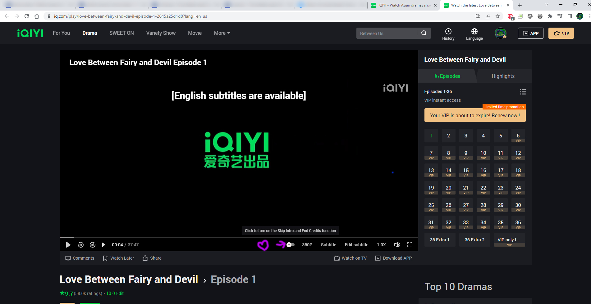
Another convenience was that it let me flip a switch, and automatically skip intros. In Netflix, you have to jump up quickly to press the skip button before it disappears, or re-awaken the option. In Amazon, it just forces you to watch the intro unless you manually move forward. Both of these are a hassle, either when I have to get up from the sofa to hit the skip button on the laptop tethered next to the TV, or when watching a show from the bath tub and my hands are wet. Even when I am not inhibited, I still value that consideration for the user in saving me a click.
One of the admitted hassles of this is trying to pick up where you left off on a show. Instead of that being on the homepage, you have to go digging into your account, and recent history list, or to straight up search for the show from scratch. it never gives the option on the homepage.
One other plus, which is nice for users is the “free samples” aspect. The services let’s you watch a handful of episodes for free with ads, of course hoping to hook you, so you can then decide if you want to pay to watch the rest. It definitely follows the marketers, “Know Like Try Buy” sales funnel.
This kind of leads into ads and distractions. The free version does have ads, but you can skip video-based ads when you pay as a VIP. One very annoying thing was pop-up banner ads in the mobile app, even when you pay to be a VIP. The only work around I had was to not use the app at all. I do have AdBlocker Plus on my computers, so perhaps it was on the desktop and my plug-in was filtering it out, but on my computer I did not encounter any pop-up banner ads. The last thing I need is an ad covering up my sub-titles and forcing me to act to dismiss them. No, IQIYI VIP does not have video-based ads though, but the in-movie/show ads might be worse.
I liked the idea of fan-engagement, but the comments to any show were not a good idea. There are too many spoilers, so definitely don’t read those.
Amazon Prime Video
Any then there is Amazon. Well, of my favourite series was Eternal Love, and I just found out it had a ‘part two’ that was not on Netflix, but on Amazon only. So I had to login to another streaming service.
I have got to admit, this is one of the toughest UIs to adapt to. When I logged in from my laptop, the video player had the tool bar on the top of the screen. Thus far, it seemed like the standard was to have it at the bottom. It feels so strange and wrong to use the top. I don’t know if it is a branding thing, or what, but Amazon wanted to be different.
One other weird aspect was the space bar. For some reason, all other video players, heck, even Pandora Radio and YouTube, let you hit the space bar on the keyboard to play/pause a video. Not Amazon. I had trouble un-teaching myself to not hit Space on the keyboard to play/pause. It seemed like an avoidable hassle to then have to change my focus of my eyes to find the mouse pointer on the screen and move my cursor to the play button. It is not ideal for streaming from laptop-to-TV.
For some reason, when I play videos in full screen mode in Amazon, the video player kicks the bucket and gives and error message every so many minutes, causing me to have to get my butt up from the sofa to refresh the browser. One time I played the video in not-full-screen, tired of toggling so much into and out of full screen to play upon error messages, and low-and-behold, I was able to stream the show without having to get up every few minutes. It really made the show more immersive not having to wonder when the next glitch would happen, but now I have the Windows OS bar obstructing what could have been a fuller screen video display.
One of the hassles here is having to take action to skip past the video-based ads for other shows. Come on! I already paid for your service, and I am trying to watch things. Don’t put up a barrier between me and the purchased service. For me, having to get up off the sofa to skip the trailer-ad is a hassle.
Conclusion
Well, that is my take from these different services. I know it does not cover them all, but that’s what I have access to.