Project Case Study
Tranquility TMS Center Logo & Website
This website design was requested after the client was happy with their logo design.
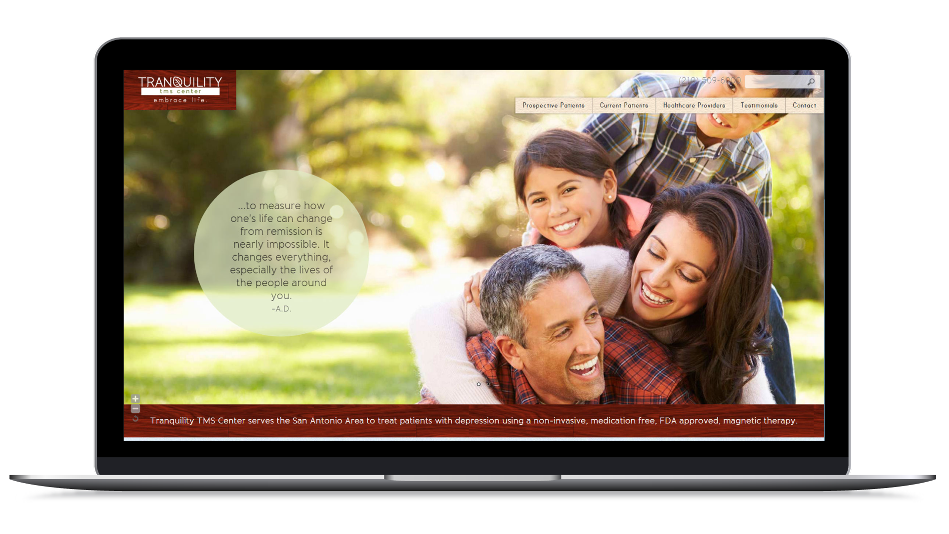
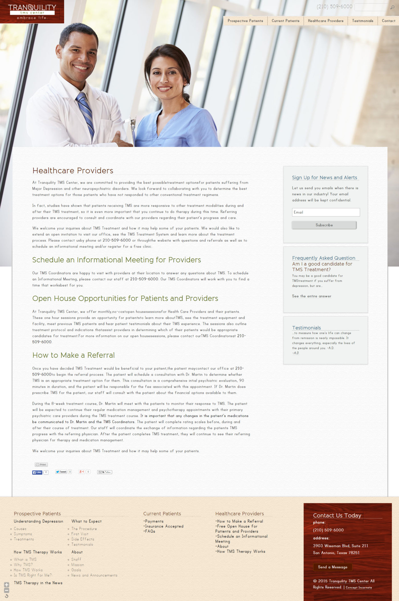
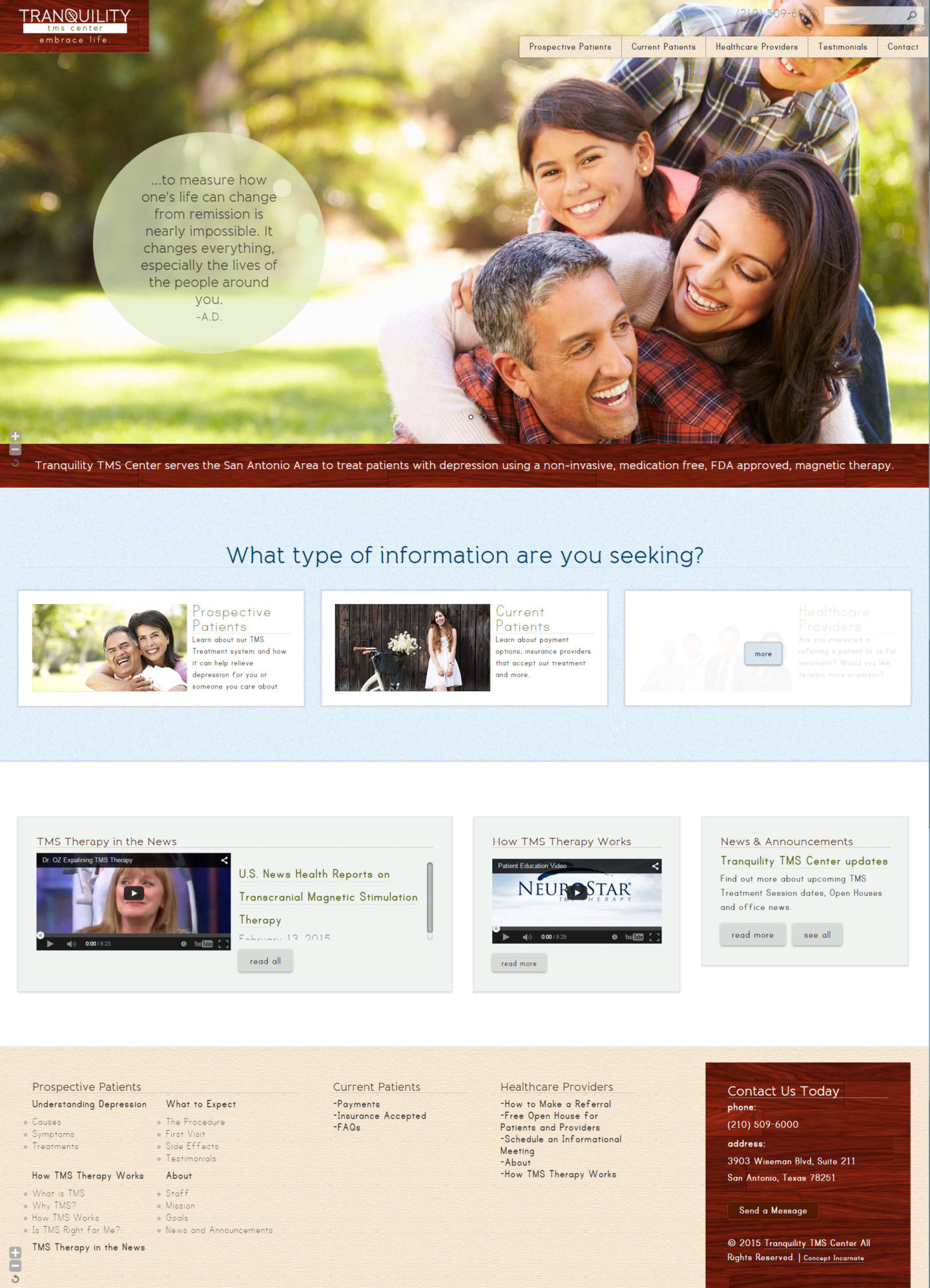
The client referenced other TMS websites and liked the content of those websites and wanted to offer similar pages to their audience. They also wanted to communicate a natural feeling in-line with their ‘medication free’ approach to treatment. After looking at other websites, we re-organized the pages into 2 audience funnels to reduce the amount of pages any one user had to sift through: healthcare providers, current patients and existing patients. Each audience group had their own set of information that they would need to take in and really wouldn’t care to take in more than that. For instance, an existing patient wouldn’t need to learn what TMS is and how it works. Healthcare providers would be the only ones interested in a demo. There were a few pages that overlapped but for those instances, we repeated the page content.
The next challenge we took on was the graphics. We wanted to go with photos that really focused on the end feeling that a patient would receive from treatment, happiness, rather than playing up photos of sad people. To enhance this idea, we used a bright colour pallet. After some client feedback, the client let us know that she wanted a more muted colour pallet so we made sure to work with her vision.
This website was developed from a hand-built template, using responsive design CSS and WordPress to allow the client to manage their own content.


