Project Case Study
The Freedom Education Project Puget Sound (FEPPS)
I wanted to thank you again for taking the time to walk me through the site. I can’t wait to delve in next week and see how everything works. We really appreciate all the work you spent on our site. We haven’t made an official announcement yet, but are already getting loads of compliments from folks who have stumbled upon it. We even received our first donation through the site last night, which is huge for us, as donations were so difficult to make on our old site, we never got any!
-Kailin, FEPPS
The Challenge
This client was not happy with their current website. it was not representing their values properly. it was difficult to find news about the organization. Navigation was confusing and they felt it was not properly supporting their marketing objects. They wanted a new site that address all of these issues, and make it easier to update by their staff.
About
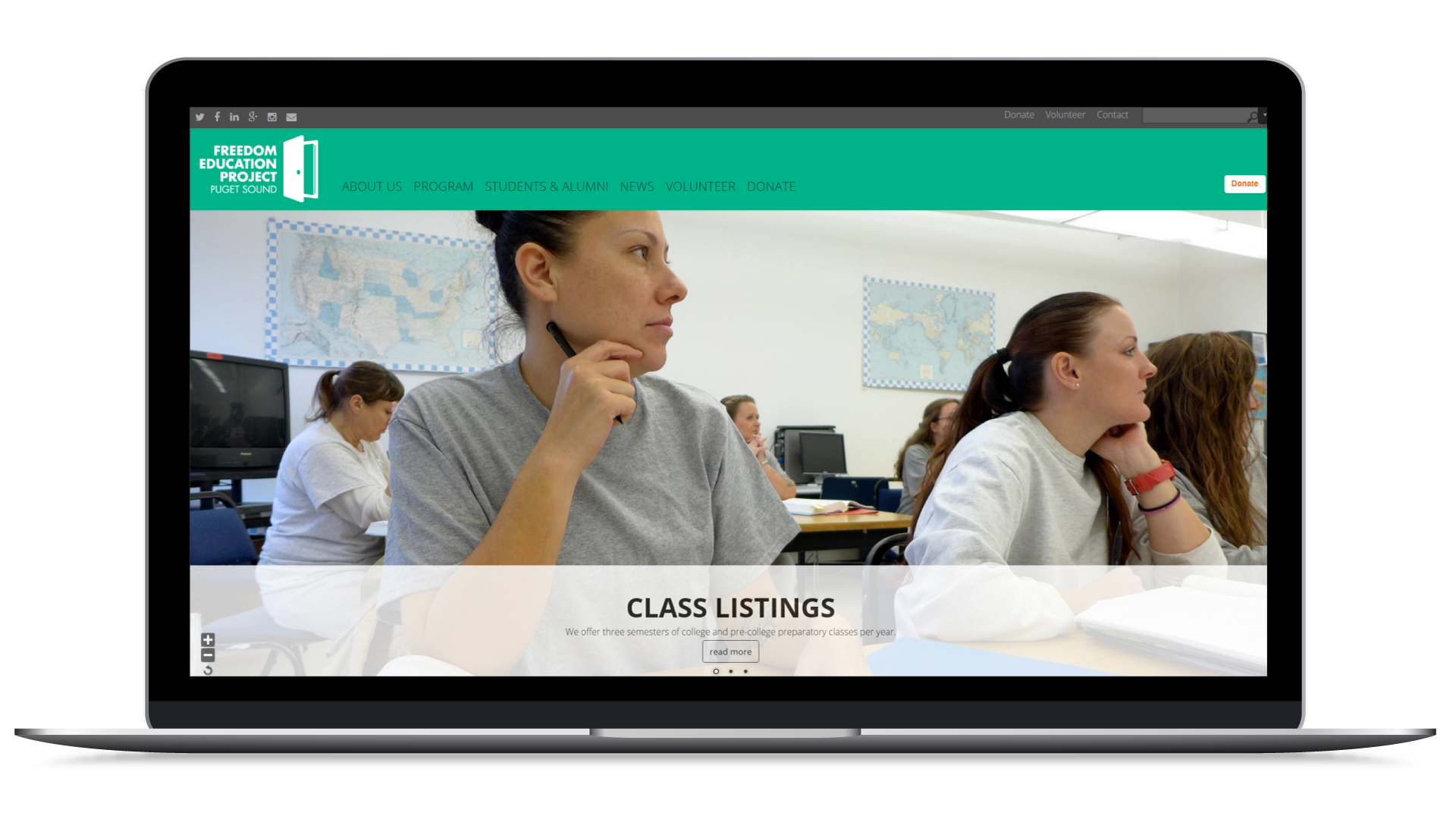
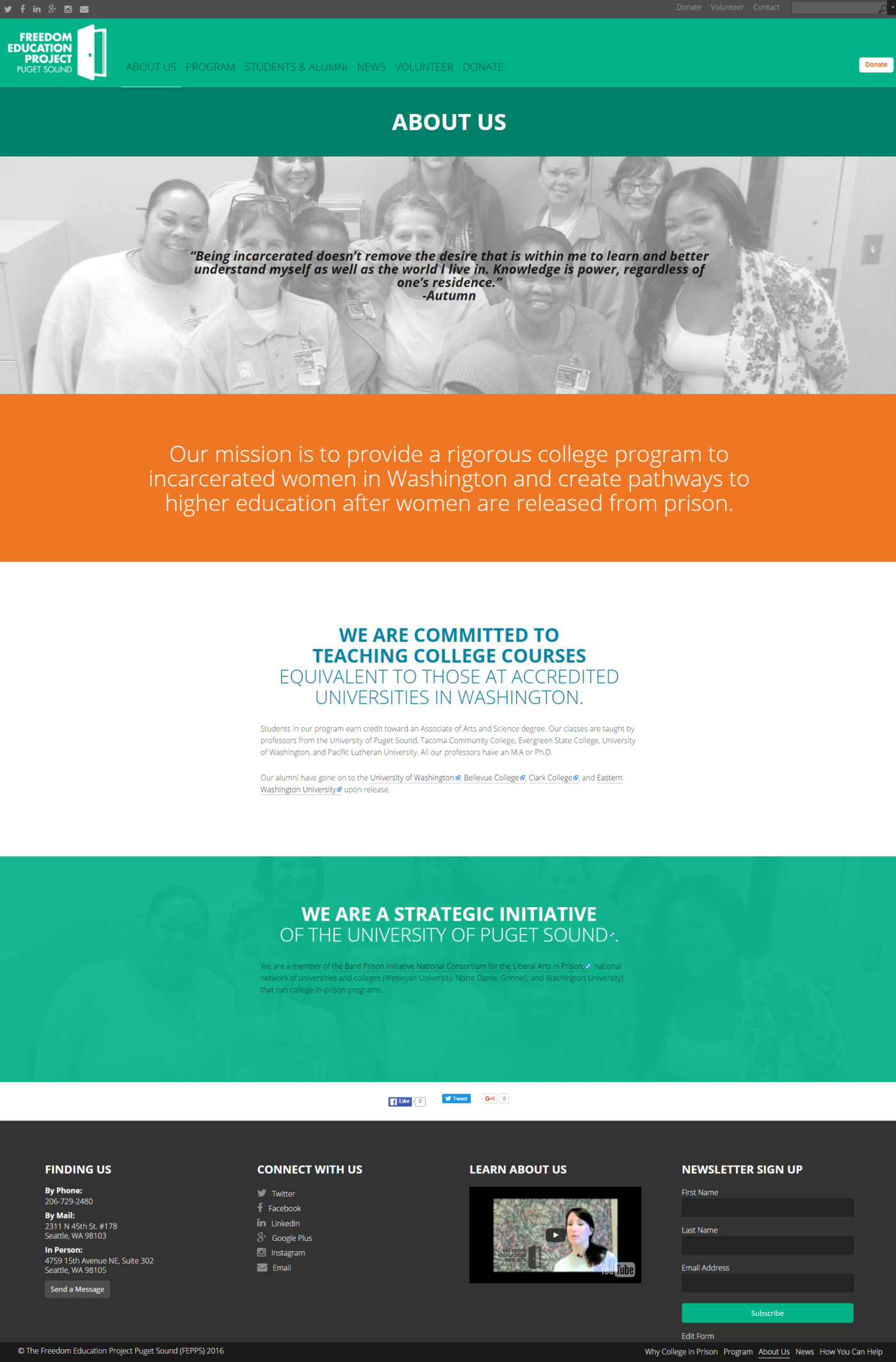
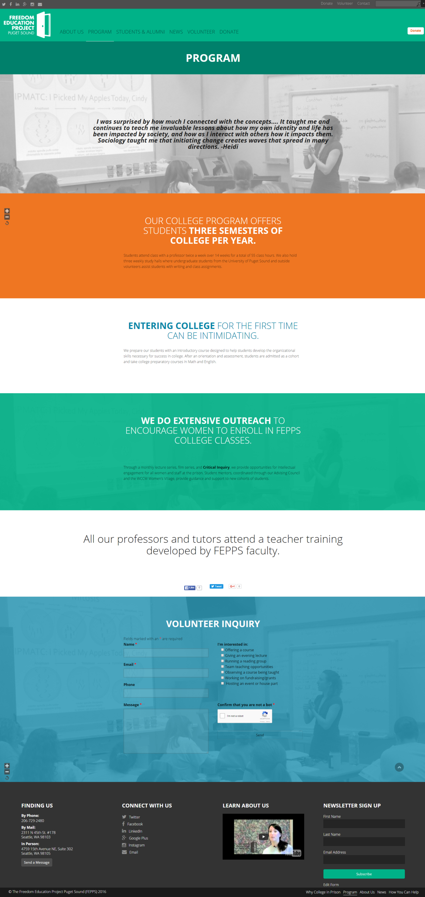
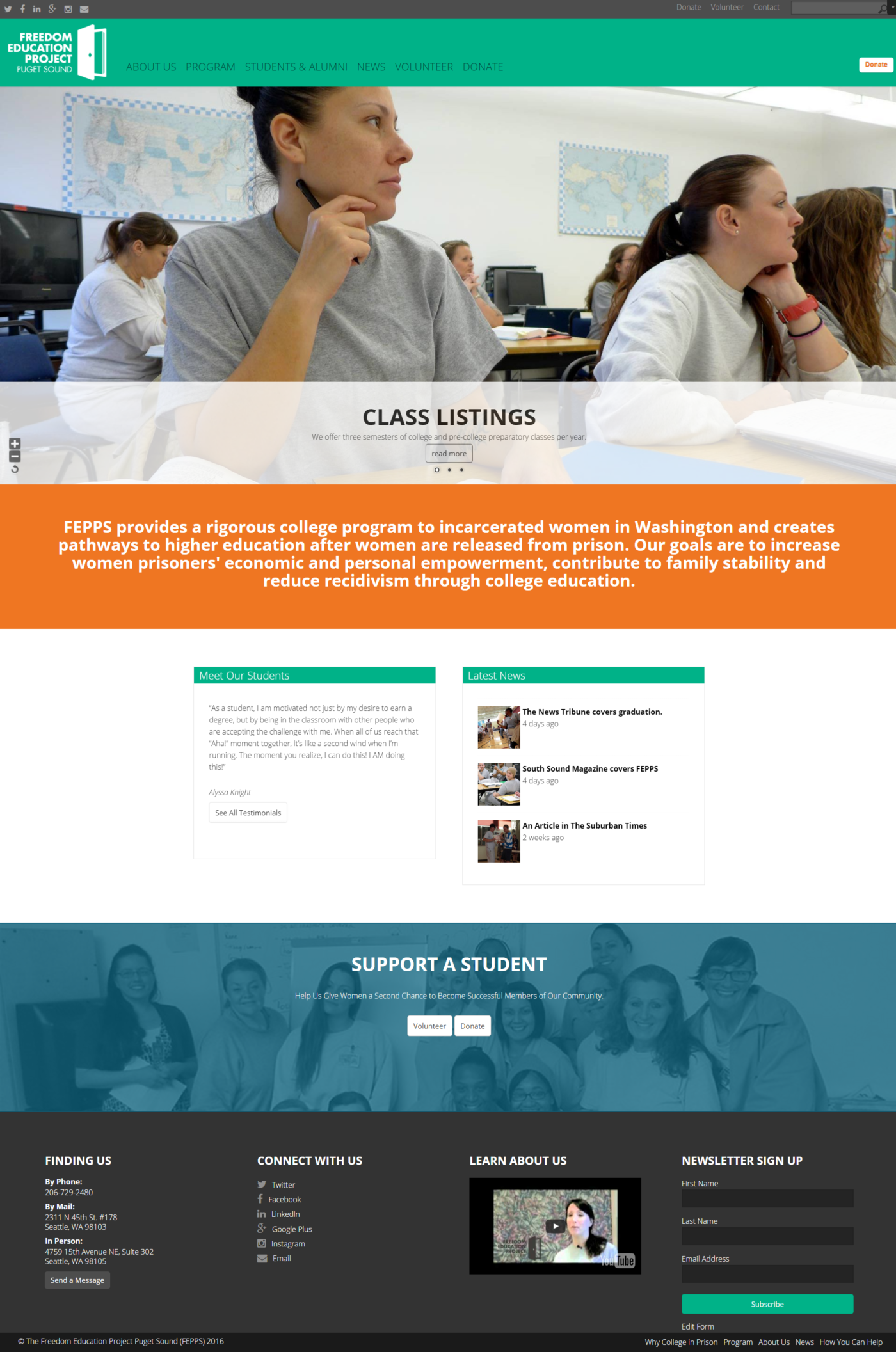
In an rather usual spin, this client knew very much what they wanted in a design. The client presented Concept Incarnate with a sketch of what they were looking for in a homepage layout. We decided to give them two design options. One option stuck pretty tightly to their sketch, while the other deviated a bit more from the skecth. The client was very happy right off the bat with one of the mock-ups, so we proceeded to mock-up a secondary page template as well. We knew this client wanted a more hands on experience with their website design and we were willing to keep them tightly in the process. We were able to develop the website fairly easily and the client was fairly happy with their testing. We conducted a screenshare training session with them to cover how to update common content in their website.
Why Concept Incarnate was the Best Choice
Concept Incarnate had a flexible and open mind. Sometimes, designers can be picky about someone else telling them how to design. To us, the client we are serving needs to be happy… after all, they are the ones paying us to make them happy? We still wanted to make ourselves happy by offering some design choices of our own too.
Why We Chose This Project
We actually enjoyed the complex nature of the page structure. it lets our skills in information architecture shine too. We also enjoyed that our helping to create this website, would result in women seeking a second chance at life, and to get higher education. Helping with a website of this nature has higher helping points per hour served, VS us doing hands on volunteer work.


