Project Case Study
Identity Set for The Law Offices of Stephanie Hoppas
The Challenge
With the economy out of the recession, this client wanted to get back out there and start making money for herself again. She was working with a clean slate of branding and needed the basics covered, inclusive of a logo, business cards, letterhead and envelopes. With that being said, the client did not just want run of the mill assets, she wanted collateral that matched the quality of her knowledge of law.
About
We worked on logo concepts based off of the client’s initial consultation. We felt that all presented logo concepts were great options, so the client could only make a good choice. Since the client is a family law lawyer, we tried different combinations of ideas, such as:
- Diamonds (as in a wedding ring)
- Wedding rings
- Birds, which represent freedom
- Phoenix, representing a re-birth
- the meditating Zen hand pose
- Someone in a sitting meditation
- The scales of justice
Here are the sketches that we presented to the client:
Here are the revisions presented to the client:
Upon the choice of a logo concept by the client, minor revisions were made to clean up the logo shape, final logo selection colours, and placement of typography.
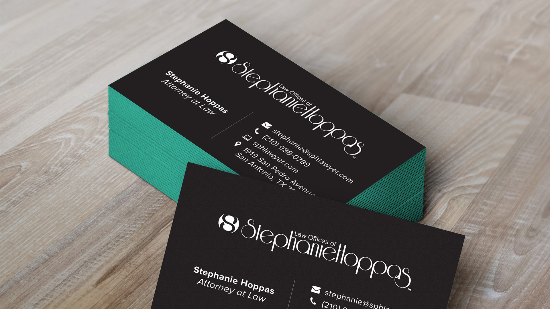
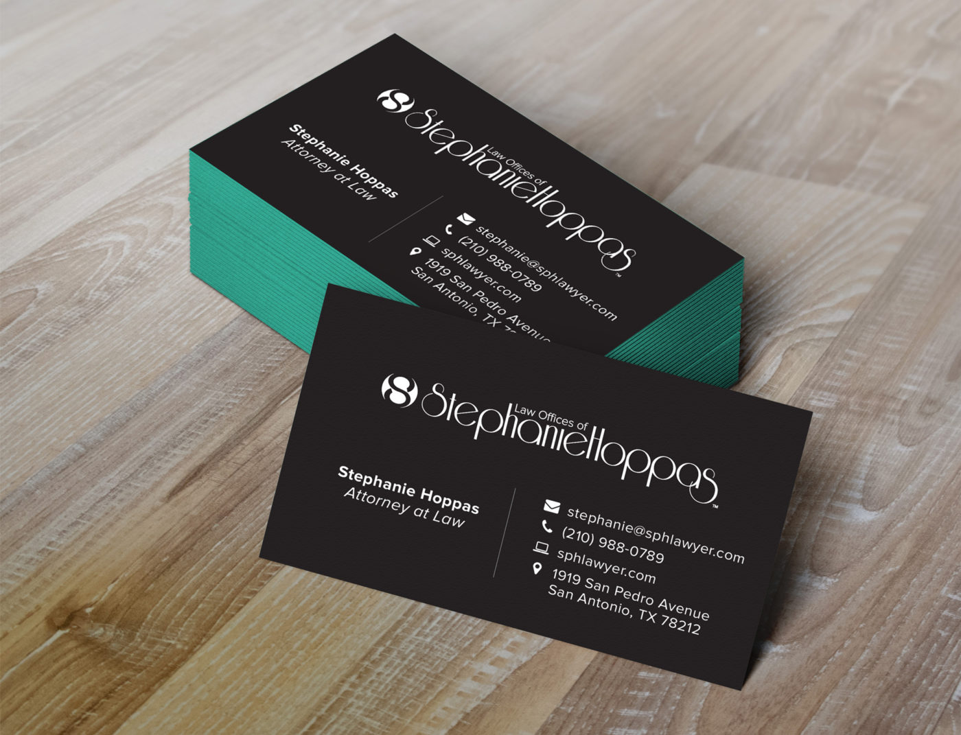
We then moved on to the business card design. We presented a good number of mock-ups to the client, of which we settled on one design. With the one design in mind, small test edits were made to the card. We then worked with the client to demonstrate print proofs, and then green lighted the full press job. We were very happy that the client wanted to embrace the variety of papers out there, using a black linen paper for the cards, which were sandwich pressed with a new bright carribean blue coloured paper.
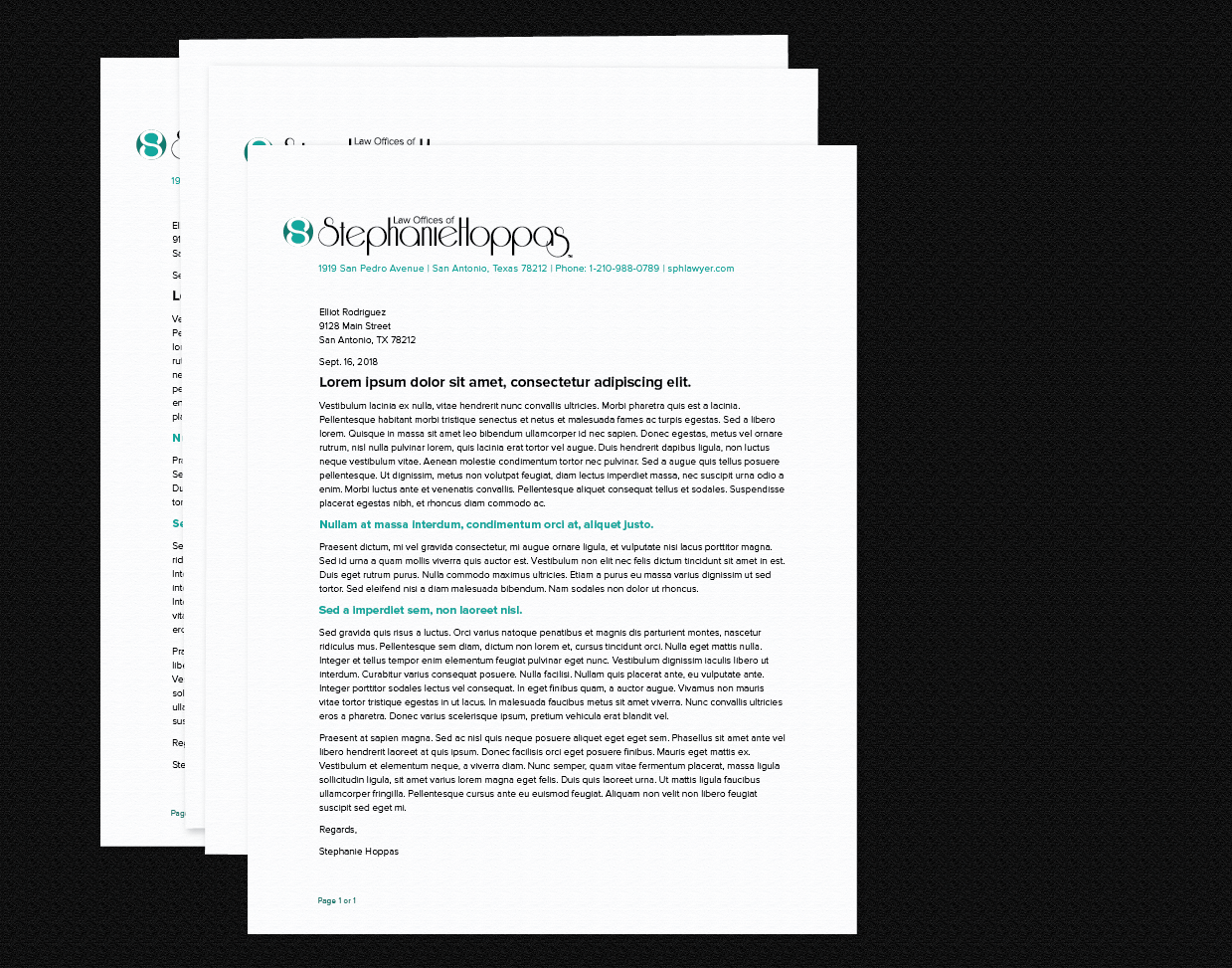
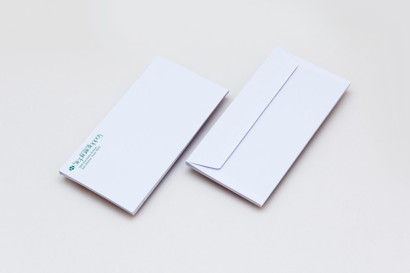
Also in the print job included design options for a letterhead and matching linen paper envelopes.
Why Concept Incarnate was the Best Choice
As the client has had graphic design education in the past, she had a great appreciation for good design. Many clients do not get to fully verbalize why they like designs, but they can understand the big picture feeling of a design. This client was able to appreciate the kerning of type, concepts behind the logo, and the non-verbal communication effects of designer papers.
Why We Chose This Project
As a small business, seeing Stephanie have the confidence in her skills to get back out there with her law practice was great. We enjoy when people jump off the hamster wheel of making money for someone else, and start making money for themselves. We knew her appearance would have a great impact on opening the door to success, so we had to help.

