Project Case Study
Cedicon Print Collateral
This client came to us with a clean slate. The company’s owner knew that he needed to start marketing his company in a more professional manner but was unsure of where to start. He knew that he needed a logo, business cards and brochure.
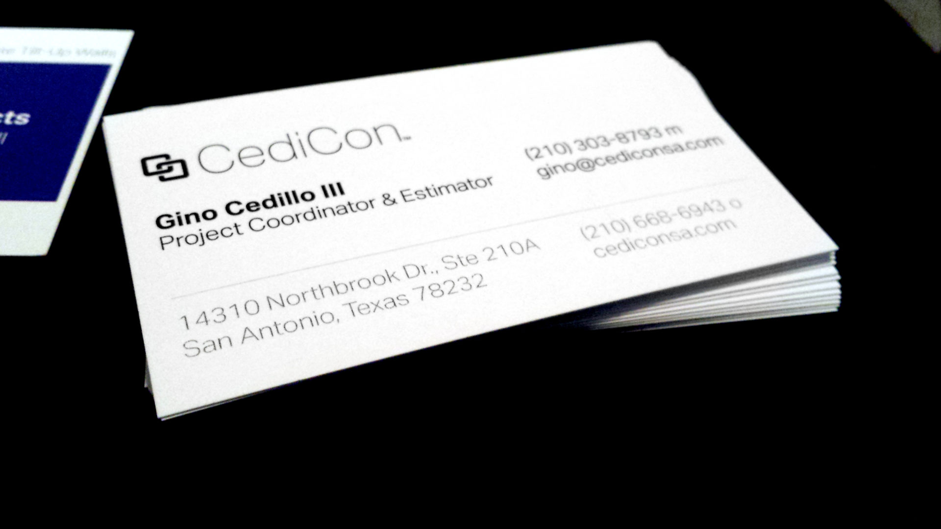
We first started off by offering CediCon a professional looking logo that communicated a metaphor and had visual interest. The metaphor in the logo was brought by the linked chains; these showed trustworthiness and reliability. The visual interested in the logo was brought by the repetition of the letter C to create the links in the chain.
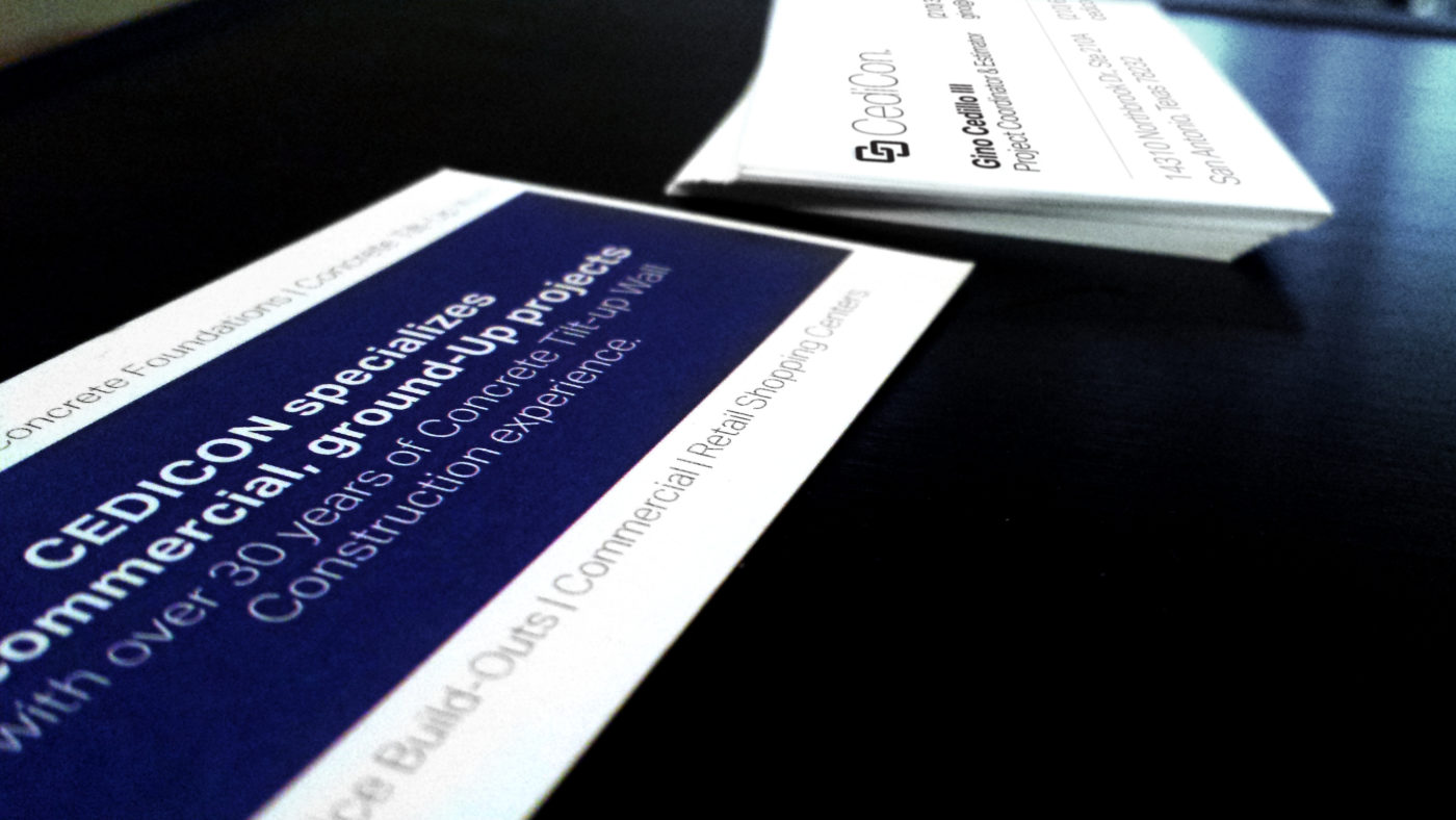
We then applied this logo to executive looking business cards, using a nice Classic Crest paper. Even though we had the option of using colour in the design, we decided to go with a classic and crisp black and white look.
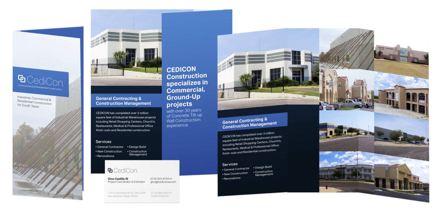
We also designed a brochure for the client. He had absolutely no marketing copy written, so this presented a challenge.We worked with the client to define his core services and unique value proposition to give him clear message to communicate. Even though the client only had a budget for a tri-fold brochure, we wanted to make the opening of the brochure an experience. As one opens the brochure, they would see a prominent sentence that encapsulates his business concisely; worst case scenario, this would be the only sentence a viewer might read. On the left-half of the partially opened brochure, you would see the 2nd most prominent thing, the large building photo, followed by the main body copy. The business owner wanted to let the photos of past construction work speak for themselves, so we presented a grid-like gallery of his building designs.
We also helped with this client to generate a mission statement that was applied to his Facebook page, in addition to selected marketing photos.


