Project Case Study
Texas Homeless Network WordPress Website
The Challenge
Texas Homeless Network had a website that worked years ago, but was not suited for 2017. This client wanted to make sure the website re-design would not only serve aesthetic gains, but would also make it easy for a user to navigate through troves of information and allow for their team to make content updates on the fly.
About
Concept Incarnate started this website by carefully reviewing their site map. They had a lot of data, so planning was very important to us. We wanted to make sure expectations were clear and that people could find their way about the website. The success or failure of the site map would result in the success or failure for homeless communities to get the help that they needed.
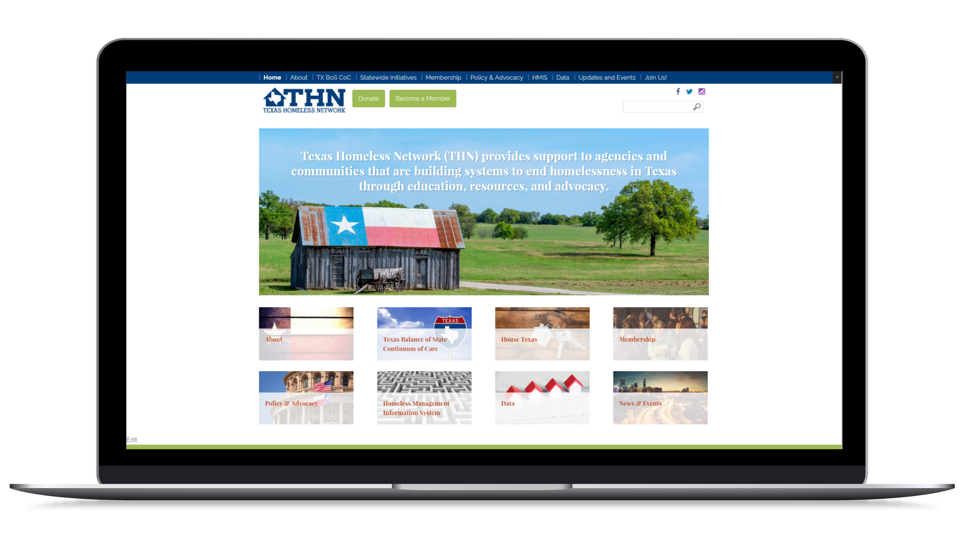
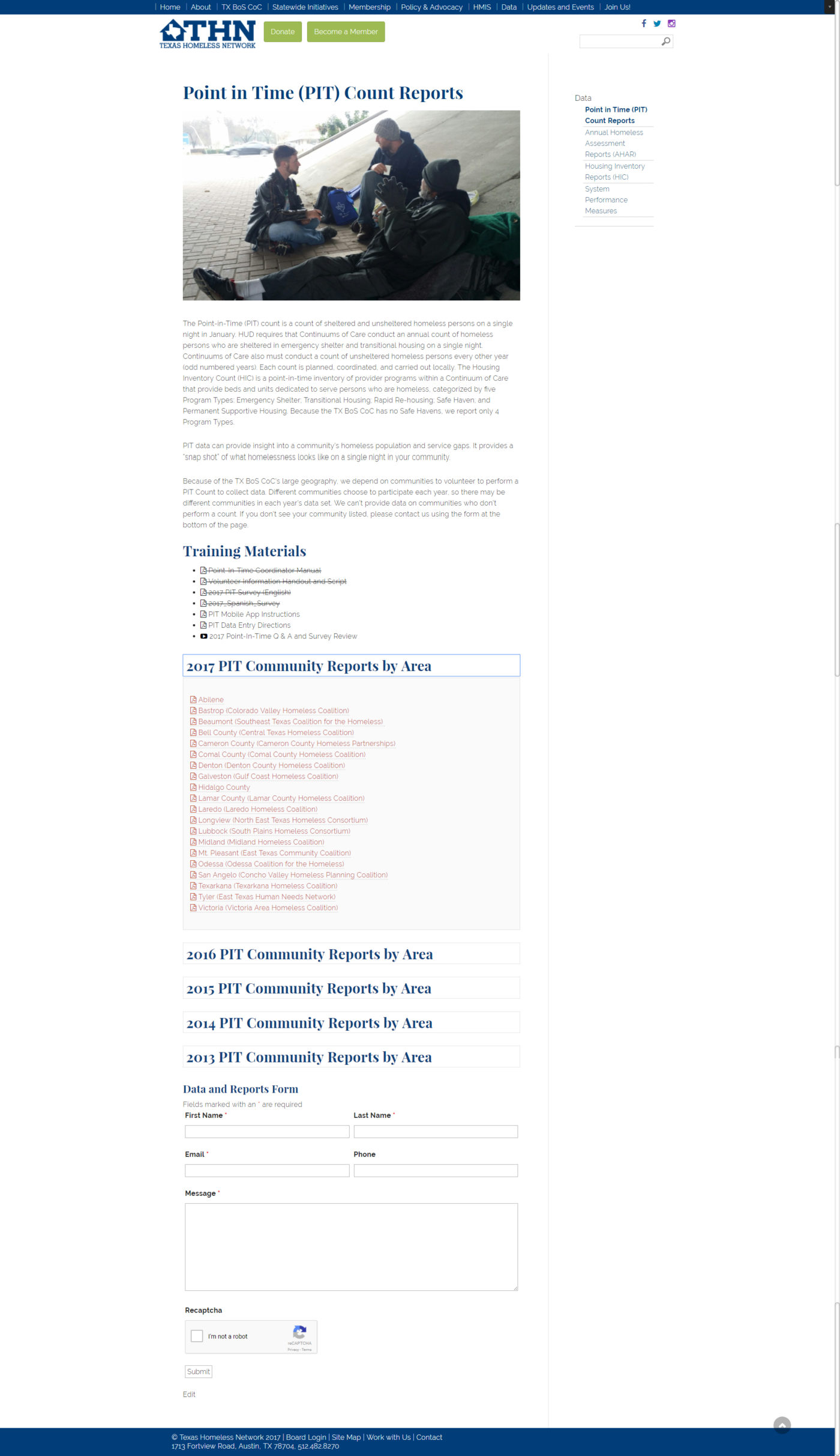
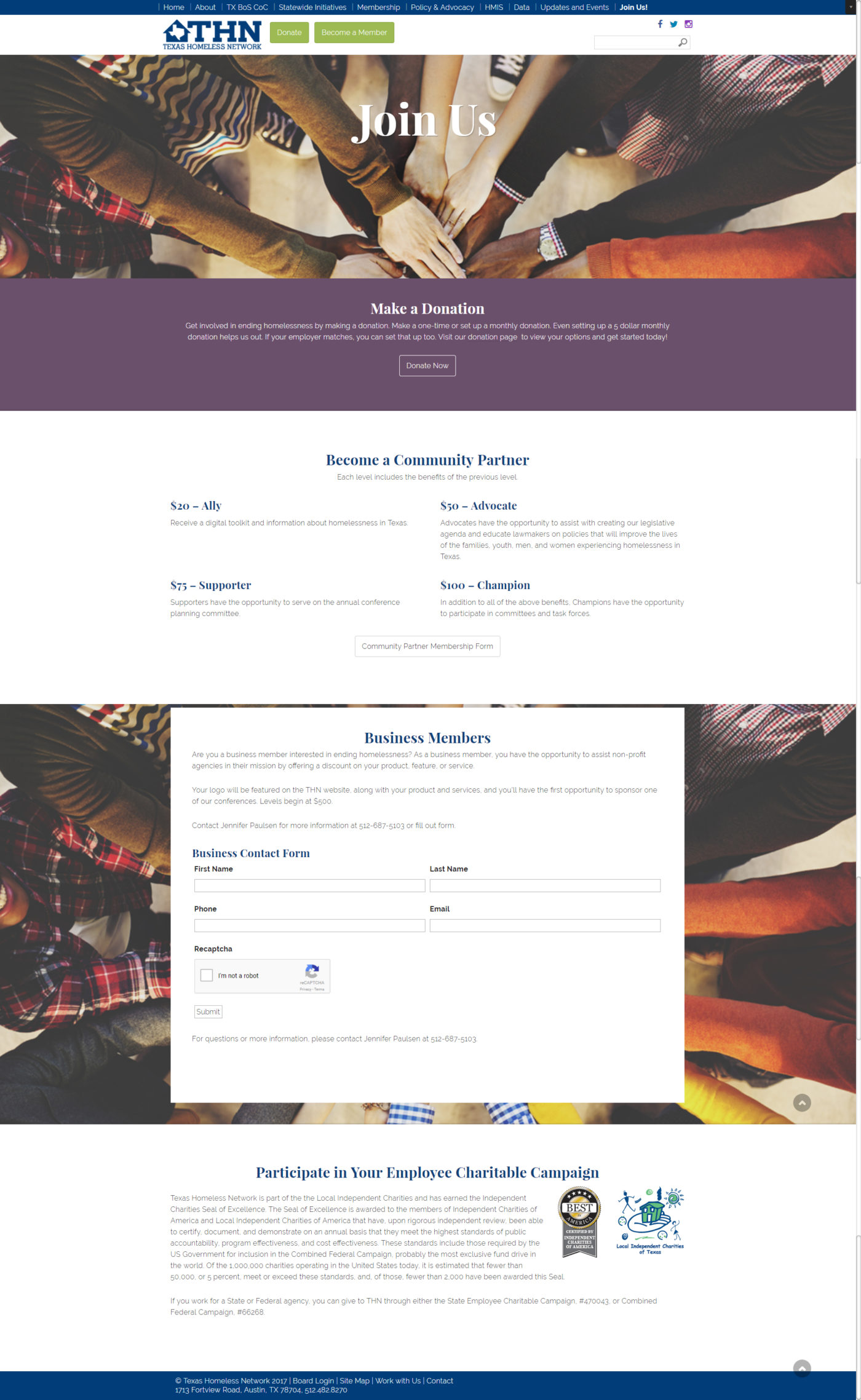
After the site map was agreed upon, Concept Incarnate proceeded to provide the client with two unique homepage concept designs. This client had an idea of what they wanted in the design, but we wanted to make sure that we followed modern design choices. We offered this client two unique homepage designs that closely followed their digital sketch. Because pages would get two or three layers deep, we decide to offer this client page template designs for a landing page, a simple page, and a page with a sidebar, depending on the content that would be showcased on the page.
This website involved much content and layers of information. In order to help users through navigation, we made sure to offer the user additional hints, like adding a PDF icon near PDFs, and giving bread-crumb like clues on the deeper levels of navigation.
Upon completion of this website, we conducted a screen-share training session with their team. In this case, the client had some in-house IT, so we were able to be a bit more hands off with the launch.
Why Concept Incarnate was the Best Choice
The complexity of the page structure was an important foundational step. Instead of jumping straight to feel-good colours or fonts, we kept our focus on the content and user flow, definitely less of a flash job, but a pretty website without a good foundation would not do anyone any good.
Why We Chose This Project
We enjoyed that the benefits of this website would be felt close to home. Helping our homeless neighbors in Texas is an honour.


