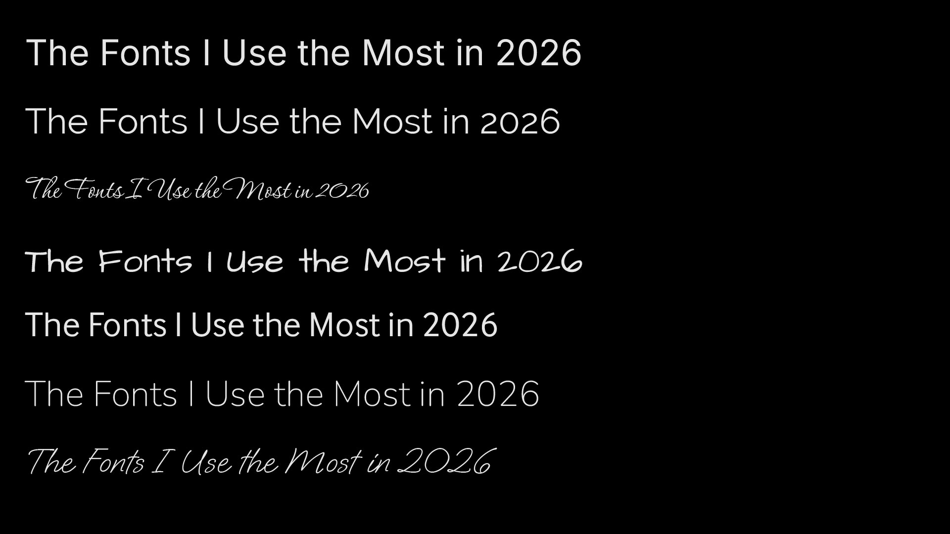

As a designer, I like having some style in my lettering. How wide or narrow a letter is, where the midline is, serif or san-serif? It all plays into visual communications of your words, before the brain even reads them. That being said, words need to be legible, so the style shouldn’t (in most cases) make letters be unrecognizable.
These are my go to fonts these days in 2026:
Inter – For UI/UX Design
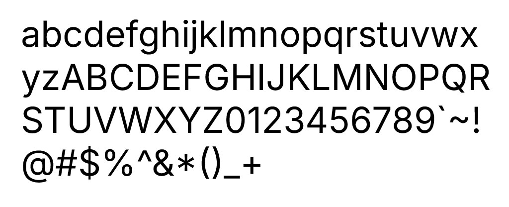
This is my number one go to font. The font has a different M and N width, allowing for high readability. It has a robust glyph set, making it suitable for using in languages beyond just English, like Comanche.
I actually use this as my base font for writing movie scripts. I know some formally trained script writers go nuts that I don’t use Courier for scripts, but since courier is monospaced, it is difficult to read for humans. Courier also does not work when my characters need to read lines in different languages. Courier is definitely meant only for English. If I was to use courier, and courier’s glyph equivalents, it would change the pronunciation of the written Comanche words, and the words would not be spoken properly by the actors. I want to use a font that aligns with the needs of the language that it written for.
I also find this font great for UI/UX or app design. Again, because of it multi-language support, and easy to read nature. I want to keep users on an app, without tripping over a hard-to-read font. Since the font has many font weights, and each weight has native bold and italic variations, it works well for an app that has a lot of font variation for headings, buttons, and or emphasis.
Raleway – For my Design Company’s Brand Font
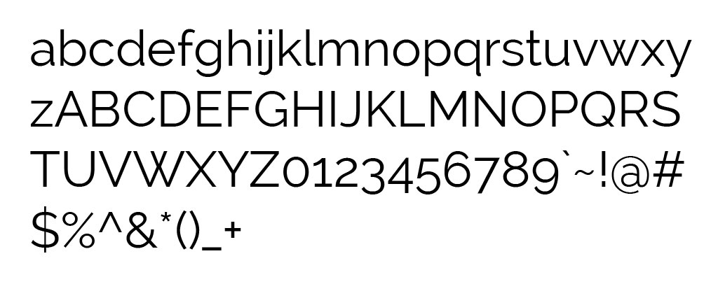
This has strong circles and straight lines in it, and has a bit more of a designer flair, while still being readable. This is the font I use for my graphic design branding.
Corinthia – For the Occasions Where We Gotta Dress Up
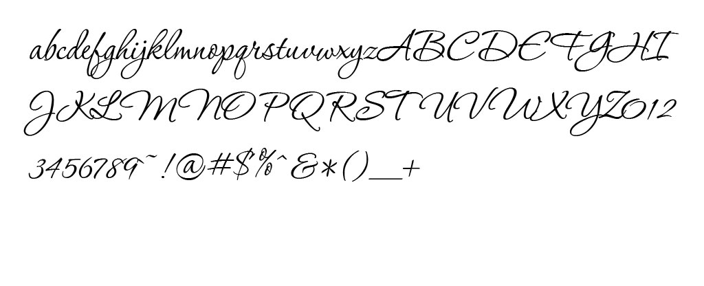
Useful for when some sorta pretty hand writing script is needed. It looks hand written enough to feel free flowing, but it has enough structure to be legible. I used it on a client website for a retirement community, just for some key headlines, as I wanted the community to appear approachable and not too stiff.
The best thing about this font is that is is a legible, pretty hand-written looking font that also has a BOLD weight, which is super rare in handwriting fonts.
This font can also work for situations where you want to look artsy or fancy, perhaps a wedding dress website, or a handmade clothing brand.
Architect’s Daughter – For Comments
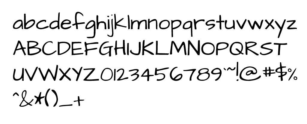
Now, I don’t use this in live, customer facing designs. I use this because it is obviously not a designer font; this is a bad font. Sometimes in a mock-up, I will put comments to developers on functionality in this font, so it is clear this comment is not part of the design. I think there was actually a better hand scribble font that I found at some point, but since this starts with an A, it kinda is at the top of my font list, and I already have the name memorized in my head.
Honorable Mentions
Interface
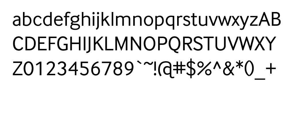
Interface has a very clean look, but it has a view details which give it some warmth, particularly on the lower case G’s. As opposed to Inter, this font has just a bit of style, while still being very easy to read. It also allows for various font weights and italics.
Nunito
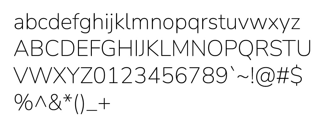
Nunito has a few weights, enough to work with and one italic version. It has a round, bubbly style, which is nice where you want to look more modern.
Oooh Baby
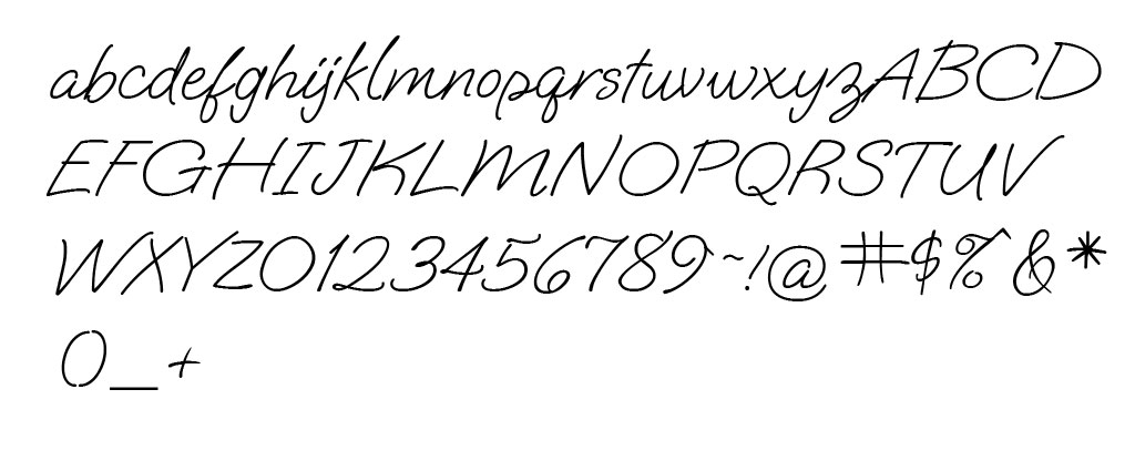
I have been playing with this font in of of my current web designs. It has the loose feel of a hand written script, but is easy enough to read. It looks more causal, and not overly elegant. While trying to put it into a logo, I ended up modifying the base font with extra connections between letters to make it more truly hand written.
Your Own Hand Writing
Don’t forget, you can also write out your own wording by hand and use that. If you identify as a graphic designer, this kind of extra touch should be something that you perceive as fun, and necessary, depending on the vibe you are going for. While, it would not be advisable fot paragraphs of text, it would be a reasonable step for a logo or headline of a page design.