Project Case Study
Moments and Milestones Website Re-Design
This long-time client was interested in making a few text and photo updates to their website. We answered their questions about their simple content update with the idea of proposal a website overhaul for better bang for their buck.
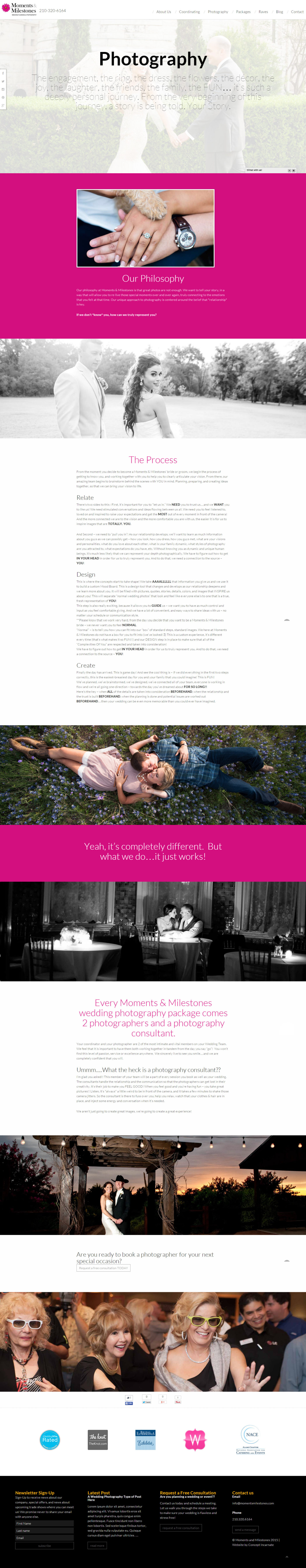
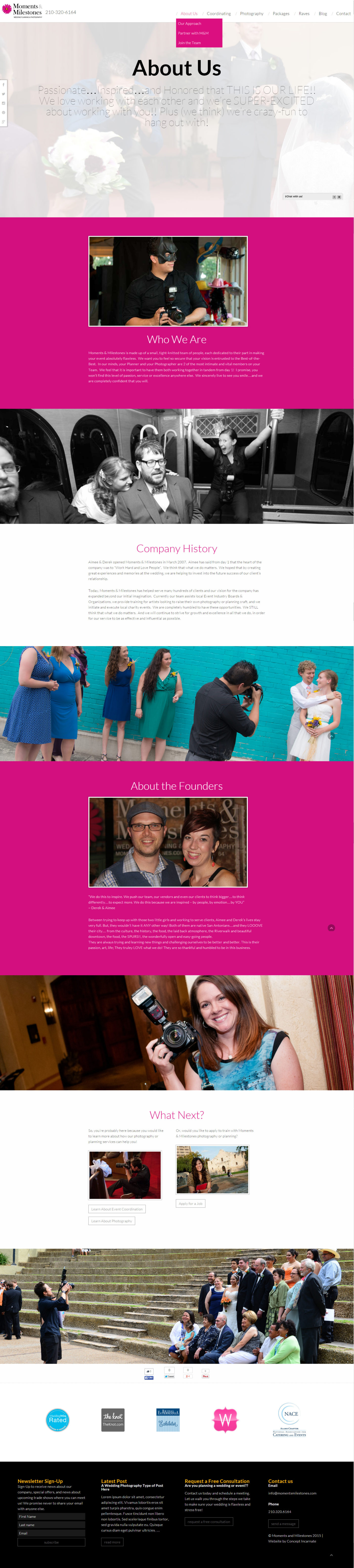
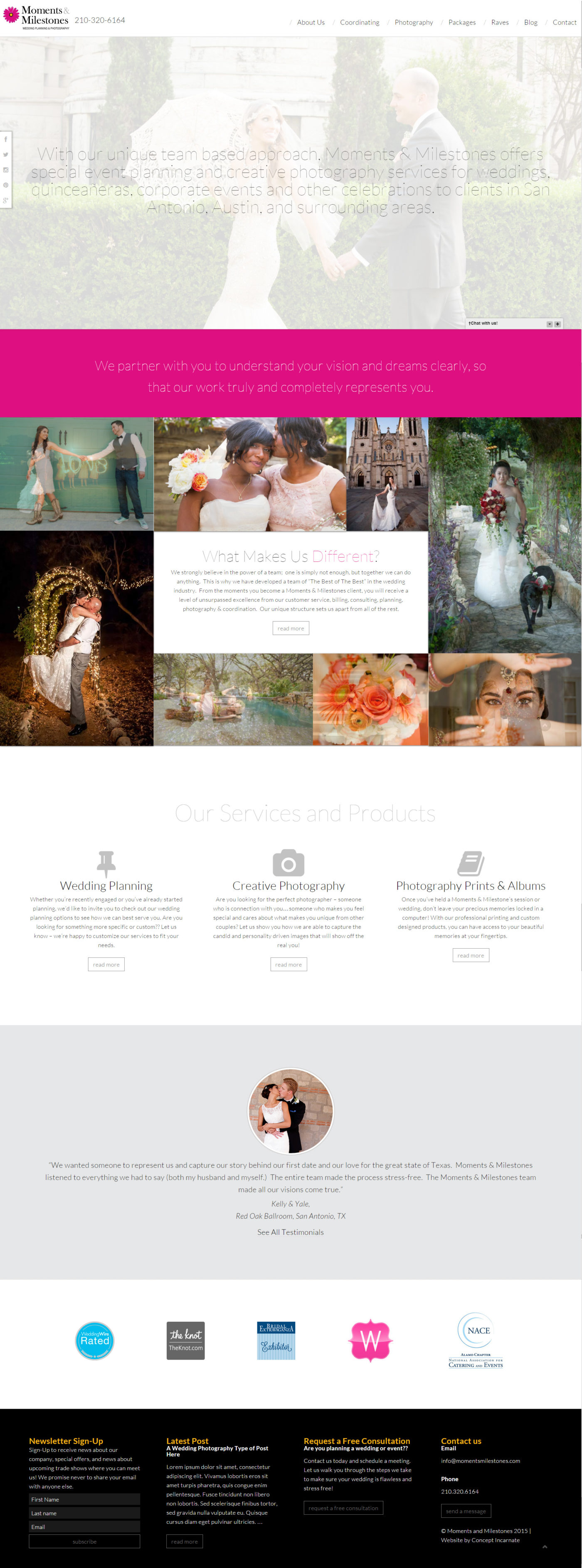
The client liked their colour pallet and logo and wanted to continue using those in the new design but with a more fresh appeal. Instead of using heavy applications of black, we used big blocks of pink and white to give a more approachable and light feeling to the website design. We also decided to use only sans-serif fonts to make the design look ultra modern.
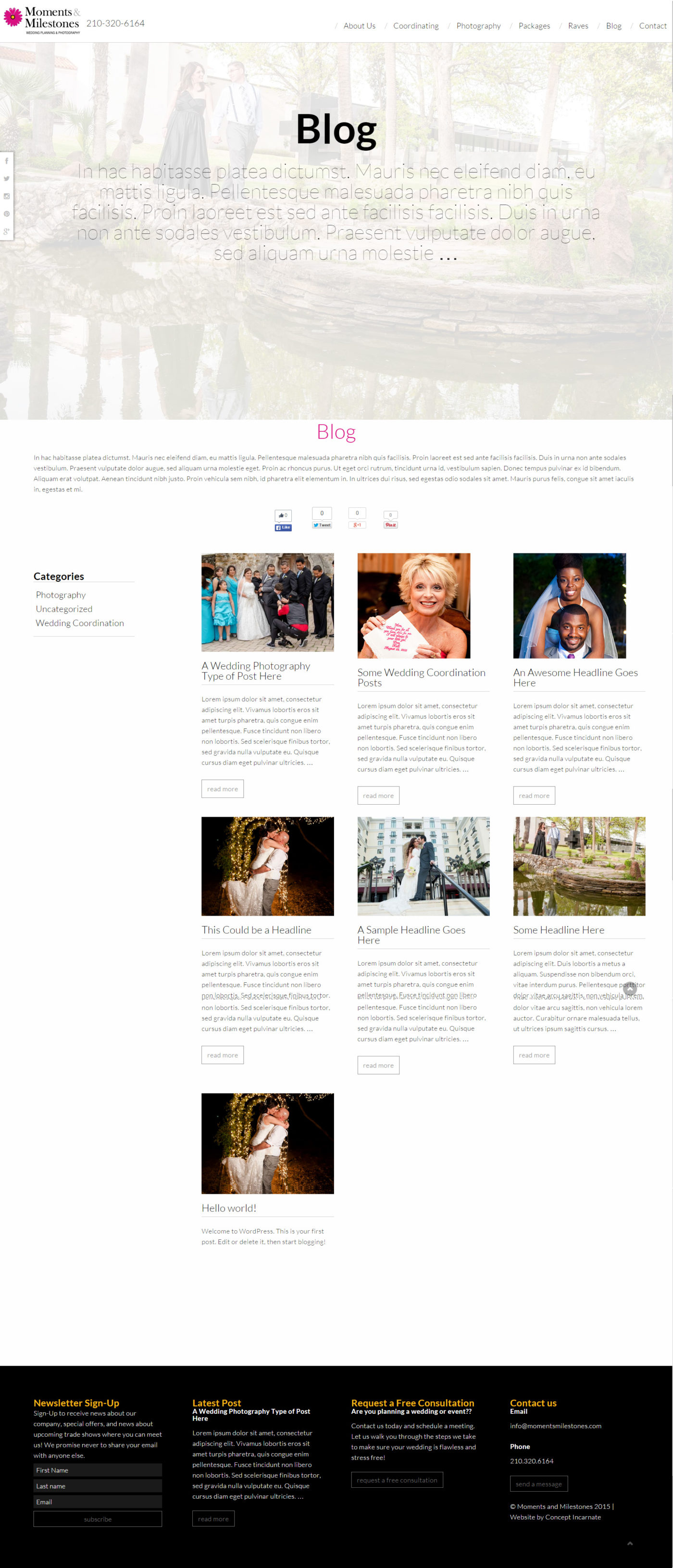
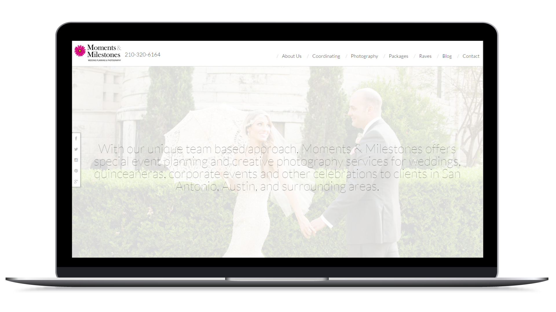
In keeping with the modern look, we made the website fill the whole screen, instead of confining the design to a small box. We also added in a few marketing queues, like offering a newsletter sign-up to viewers still just looking around for photographers, and easy access to requesting a quote from the photographers and to contact them.
Designing the Homepage
We know a big problem for a lot of websites is that it is not clear what a company does, where it does it, and for whom they do it. We combated this problem by creating a single sentence that answered all of these questions website visitors quickly as at the very top of the homepage. This was followed up by a second sentence directly under that statement.
Below those sentences, we introduced a photo collage that surrounded a paragraph about the what makes the company different from their competitors. This is often something that is asked by website viewers, so we thought it was important to let viewers read this fast. A version of a photo collage was used on the previous website and the owners really loved it. It did not seem to have a great functional purpose in the old design, but by pairing it up with this ‘what makes us different’ text box, we felt the photos now were justified in being included in the design. We also made sure to build the collage in a way that the client could update it on their own; the photos were no longer locked into a flash file.
Below the collage we gave a clear listing of the top services provider by the client and links to read more. We wanted to keep it clean, simple and to the point. We also allowed for the client to have the capability of updating the icons in the future if their services ever changed.
Another thing that really converts someone from just ‘browsing’ the website to someone that feels good enough about the company to ask for a quote is testimonials. This client had a long listing of testimonials which was easy to work with. What made their testimonials even better was that they had real photos of all of the people who left reviews; using this too in the design help really fortify the viewer’s confidence in the client’s capabilities. We wanted to keep the design fresh by keeping all photos in a circle shape.
Finally, to wrap up the homepage we included badges and association icons to again help the website viewer’s confidence in the company.
Designing the Secondary Pages
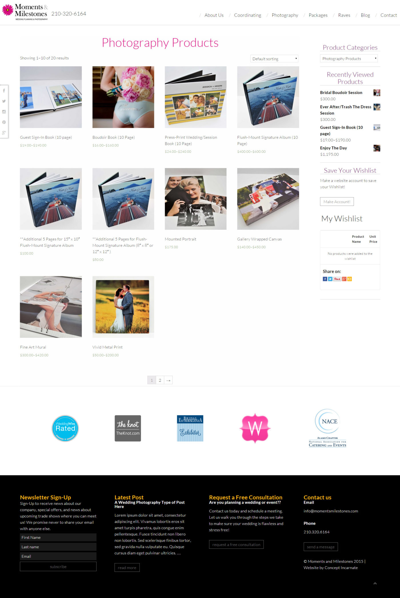
Since this client is a wedding photography company, we took advantage of their access to a huge quantity of high quality photos by completely embracing photos through out the website. This gave us a few good benefits. There was no longer a need for a dedicated photo gallery. Having the photos integrated with the content helped to break up long runs of text with beautiful graphics. The design lent a hand to connecting with the audience as the photos helped to tell the story of the company. You will notice most of the secondary pages go in a pattern of a block of text, followed by an over-sized, edge-to-edge photo.
Other Website Features
Wishlist
The client wanted to let viewers estimate a price for their services so we added in WooCommerce and a wishlist plug-in. Viewers could then play around with adding services to see what their price will be.
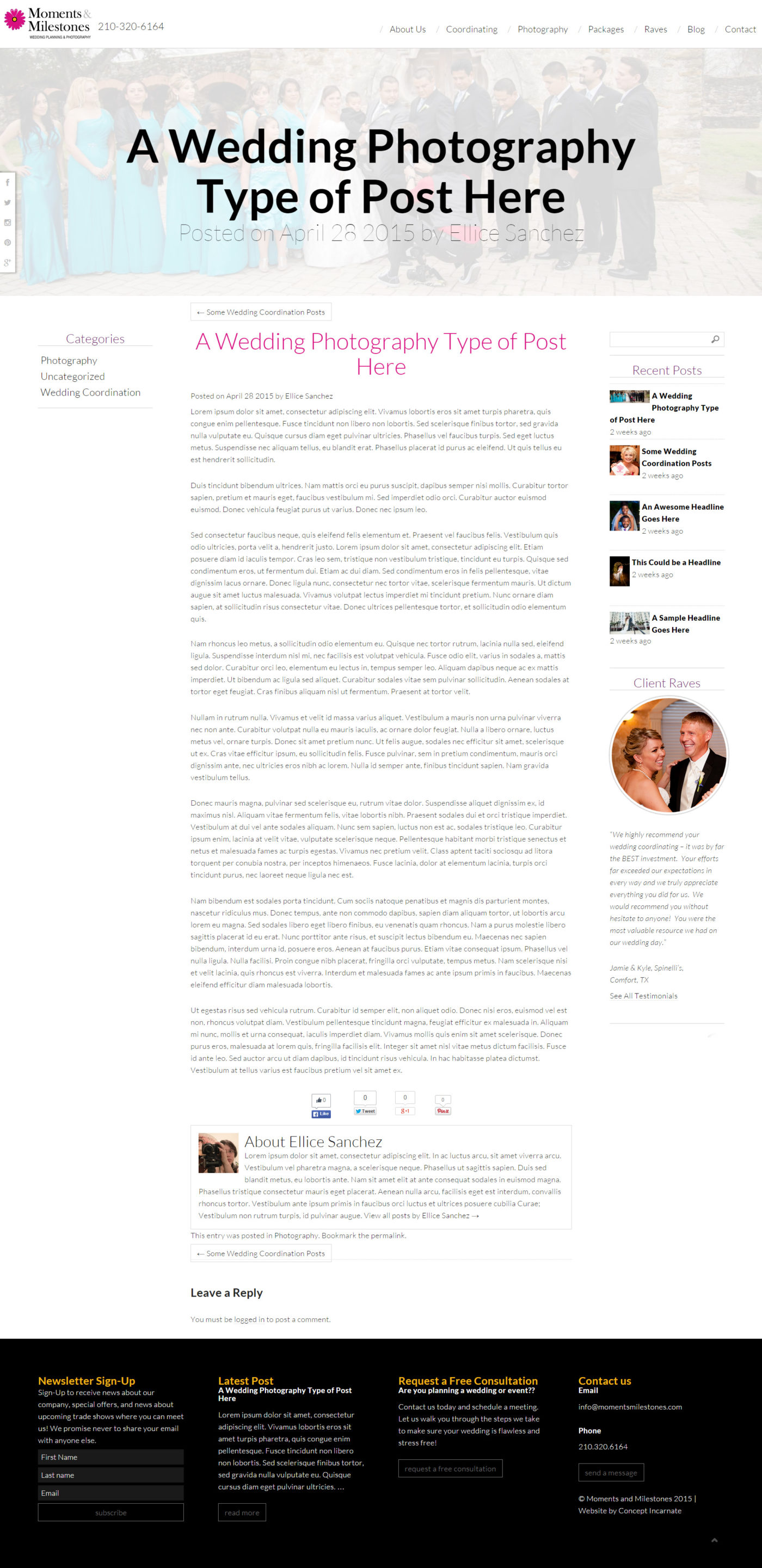
Blog
We gave the client a blog to keep their passive viewers interested piqued.
Why Concept Incarnate was the Best Choice
Other website developers may have stuck so closely to a rigid timeline and processes that there would not be room for creativity. We were flexible with content delivery dates and worked with the client to make their content even better and present it in the best way possible.
Unlike some designers in San Antonio, we made sure to make the WordPress website in a manner that allowed for full content update-ability by the client. We also considered responsive design tricks as a standard offered in website design.
We minimize technical headaches from the client by setting up the hosting environment for the client and launching the website when it was ready. We also set up re-directs from the old website to the new website to make the transition seem-less to users.
Why We Chose This Project
Having access to a large quantity of great photos can be a restriction for some clients due to budgetary constraints. This client had a gold mine of great photos which made working with their photos really easy. We jumped at the chance of being able to design a photo-heavy design!