Project Case Study
Generali Application Design Overhaul
This was a sub-contract to a programming company that included the design of the patients and providers view of the web application. We provided detailed mock-ups of all of the pages graphically, and converted the mock-ups to HTML/CSS templates for the developers to then take into their systems.
This was an extensive project which required more than just polishing up the colours and fonts of the application pages.
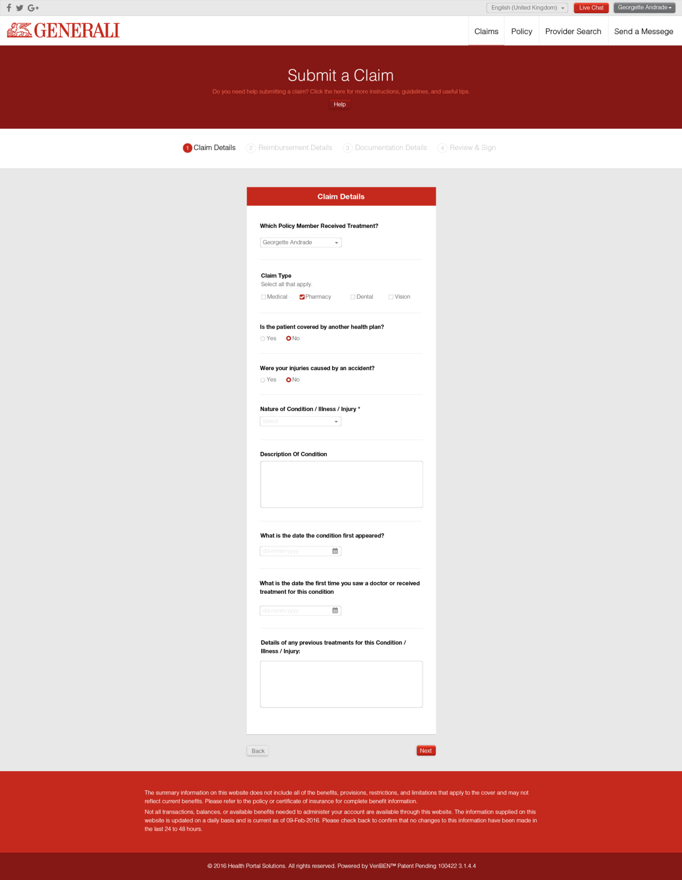
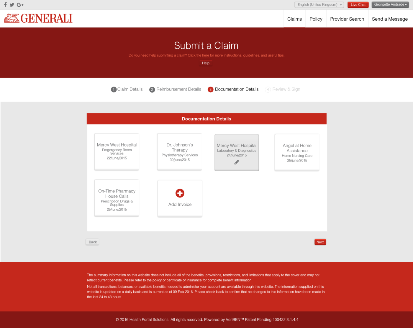
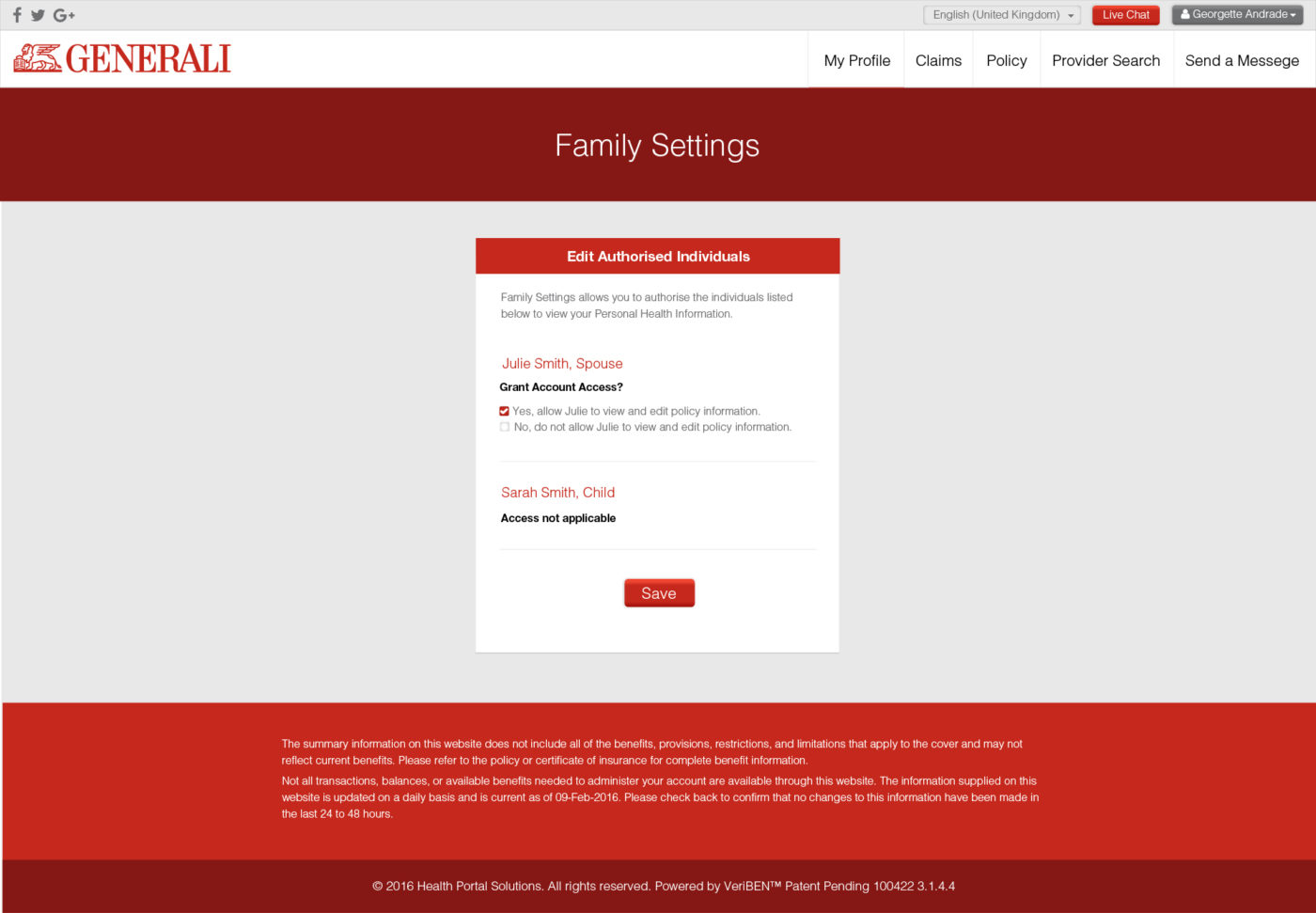
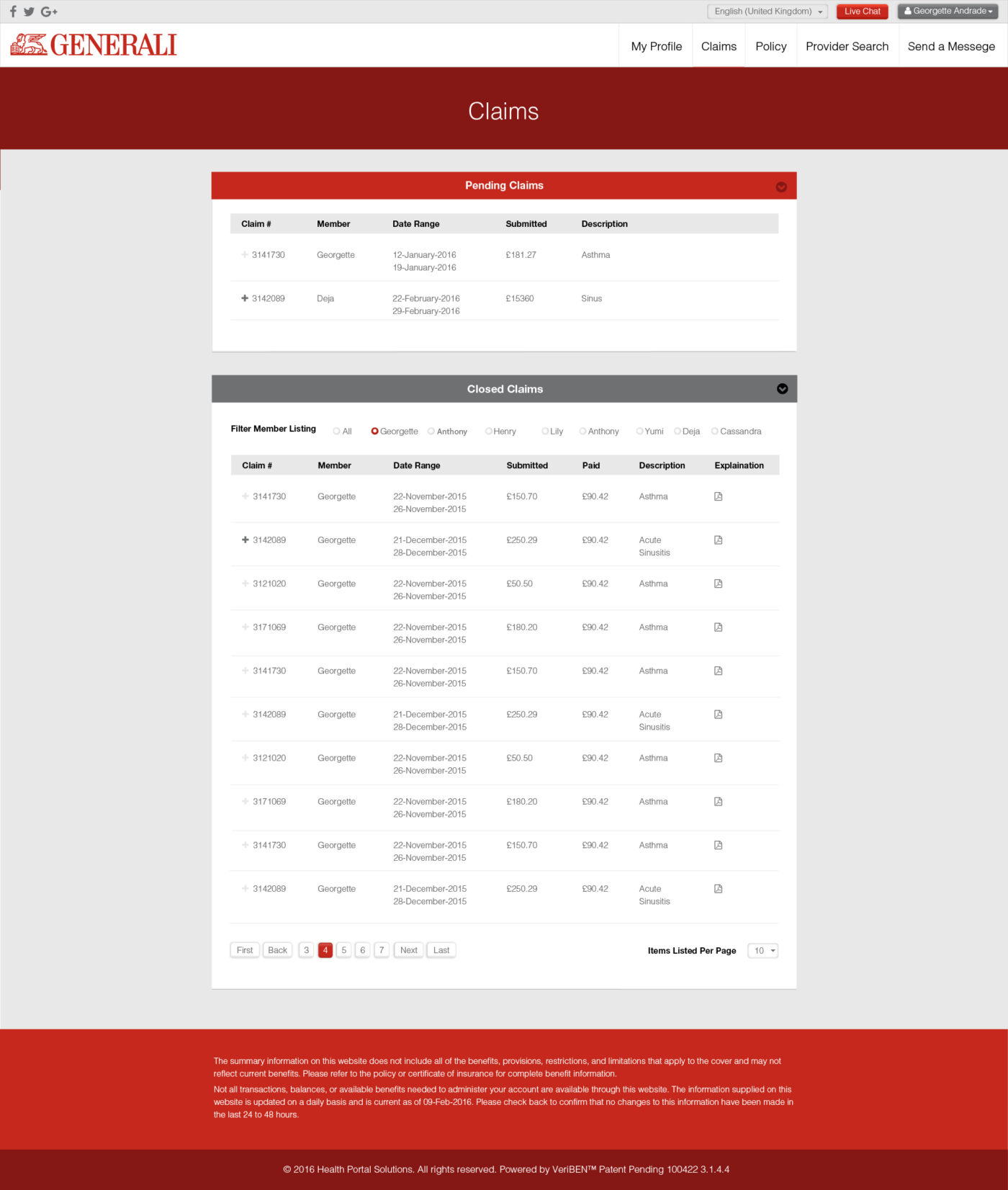
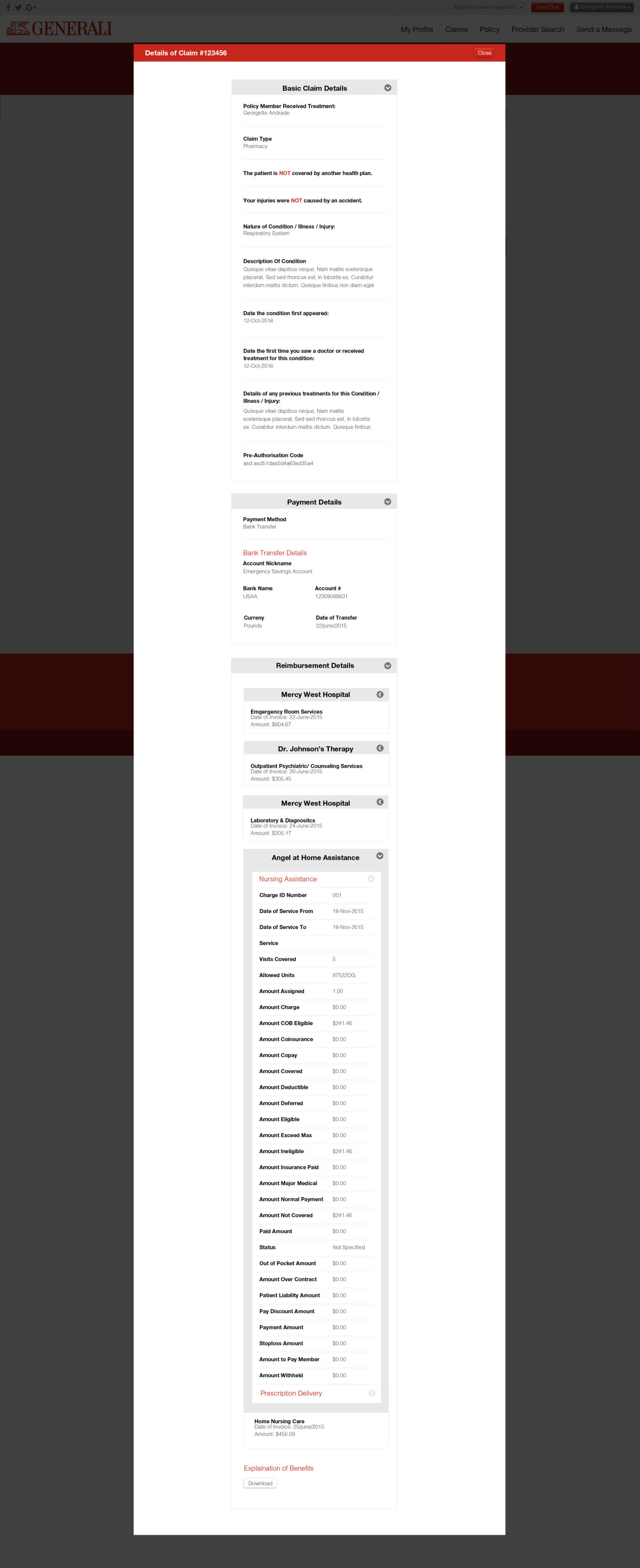
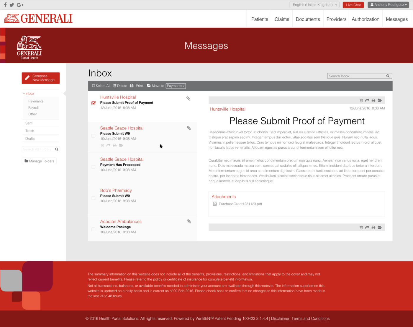
When first seeing the web application, we made suggestions to improve the flow of the pages and omit data that could just confuse the end-user. Some of the pages needed to be condensed, combined and separated. We re-worked the top navigation bar to reflect this.
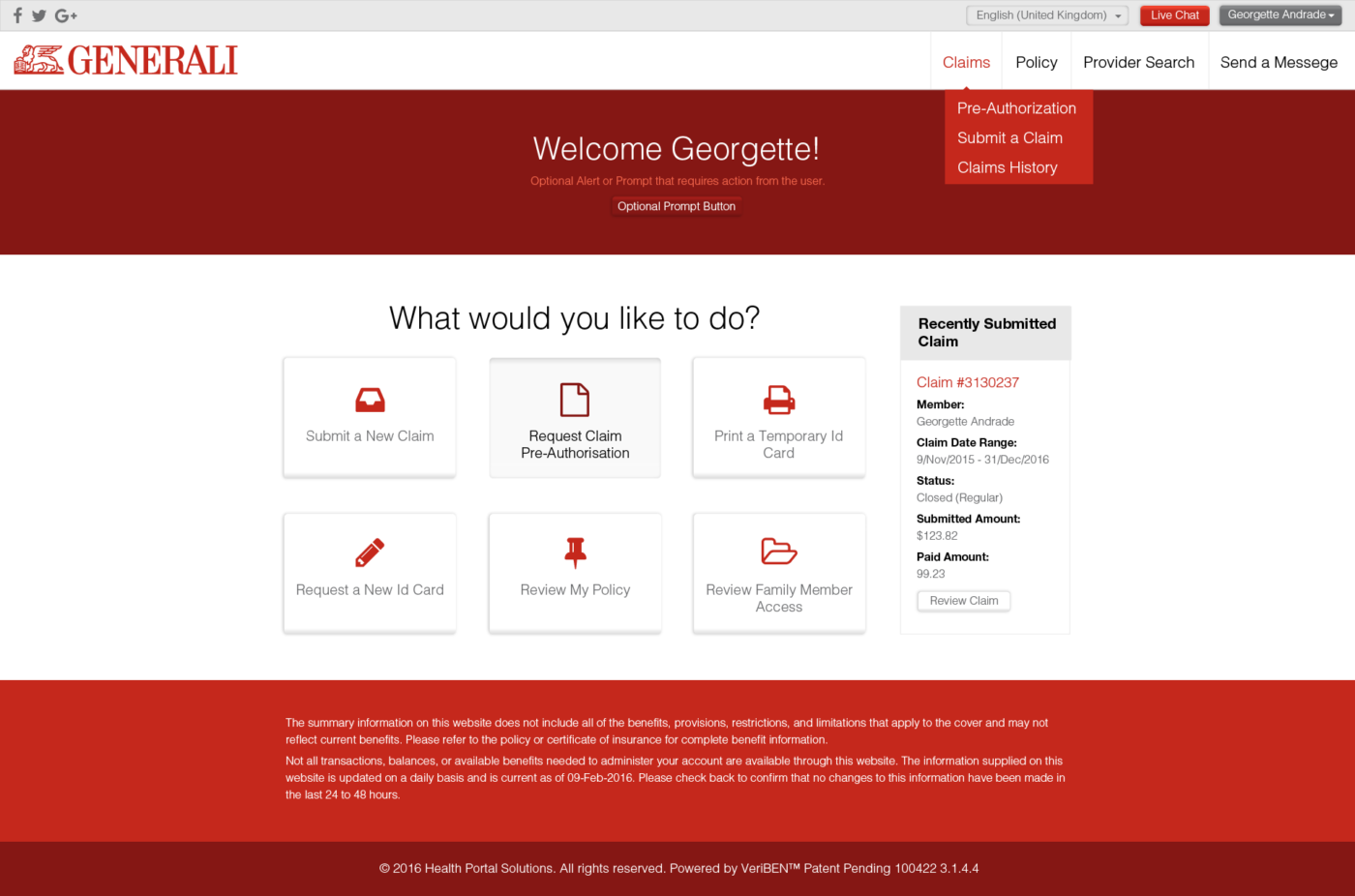
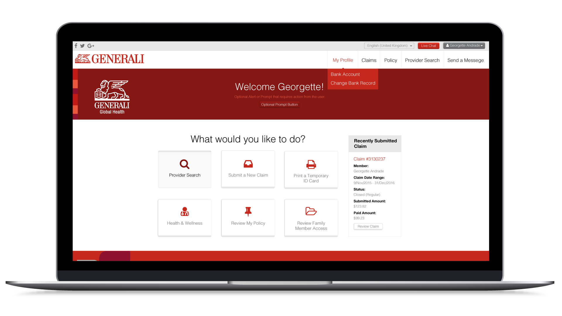
We also took a goal-oriented approach the the main page of this web application. By the time someone logged in, you no longer needed to market to them; a user who logged in would want to get straight to business with their health care. We removed the marketing-driven image gallery and personal data that someone already would know about themselves, and put in large button for the most requested actions users normally seek to achieve when logging in.
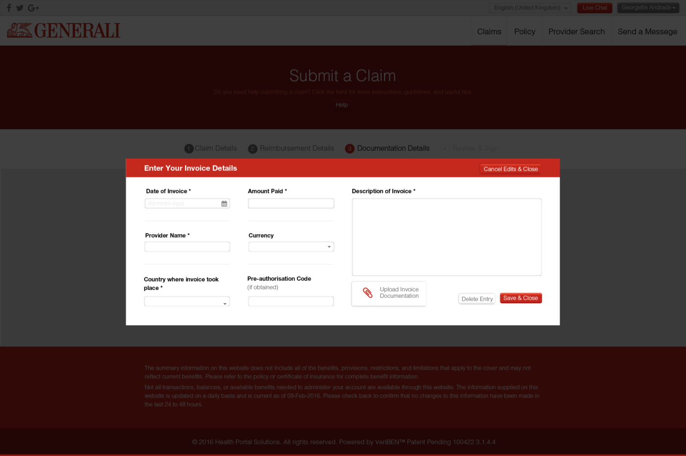
Across the board on the interior pages, simple but important things like alignment and breathing room really helped to make those pages easier to read. We found that omitting personal data about oneself helped to clear out clutter that did not contribute value to the end user.
We also introduced using icons to help graphically communicate the functions of buttons. A complaint found in user testing of the previous design was that buttons were not seen as buttons; since this web application was to serve such a wide spectrum of audiences, we decided to use a rounded corner button for all click-able buttons and removed all rounded corners from non-clickable boxes.