Nothing feels better than getting your first set of business cards. Seeing your business’s name printed in a professional manner makes your business feel like it is official. Before you take that leap of printing your cards, spend your money wisely by considering these factors when designing your card:
Define Your Audience
Your target audience may have some expectation for your card that your may want to use to your favour or break away from. For instance, a lawyer may be expected to have a classic, balanced design, while a painter may be expected to have a crazy or surprising card. Do you want to go with the flow or break away from it? Both options are good choices as long as you make them for the right reasons.
Other factors to consider that are less of a choice and more of a functional consideration are larger font sizes and high contrast for people with poor vision. If you know there will be a high quantity of people with poor vision using your card, you have to make sure they can see it.
Goals
What do you want your audience to think about you? What to you want people to do or say when they get your card? Are you planning on writing down a special discount on the card to make people feel special? Then you better use a matte finish paper and stay away from plastic or silk laminated cards.
Do you have any functional or usability requirements that may affect your business card production?
Shape and Size
The shape of your card will contribute to your businesses perception with quick, non-verbal queues. The most common size for a card is 3.5inches X 2 inches but that by no means has to be your size! You can exaggerate your horizontal plane by cutting down the height of the card or your can make your card look a bit smaler by cutting down the width of the card to 3 or 2.5 inches. You can even go with a square shape!
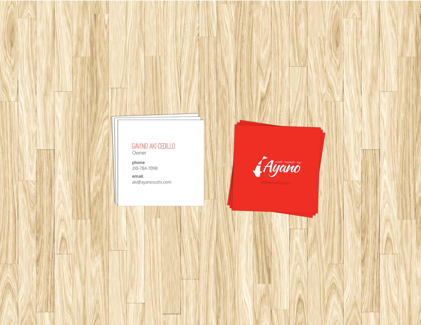
Sample of square cards.
I don’t recommend going bigger than the most common size though unless you have an extremely compelling reason. Making your card bigger makes it impossible to fit into a business card holder or roladex. Instead of going bigger, if you absolutely need more space, what about doing a folded business card?
Orientation
Hey, sometimes changing the size of your card is not an option due to the printer you chose or other restrictions. How about changing the orientation of the card and flipping it on it’s side. Now you got yourself a portrait format card that will look different with minimal effort. Changing the orientation of your card can also play into a metaphor like, ‘we think differently.’
Sample of a portrait style/ vertical business card.
Paper
The paper that you use is a big indicator of whether your cards were professionally made or if they look a bit cheap and bring down the perceived value of your company. The materials can speak to the viewers without even needing viewers to read anything!
Paper comes in any colour you can imagine. You don’t just have to choose between white, ivory and cream. Coloured paper costs may vary depending on the dyes used to colour the paper. The colour of the card may be the only colour your card needs. You may only print on the card in one colour since the paper is already coloured!
Paper comes in different thicknesses. Thick papers tend to look more high end, but also limit the quantity of cards that you can squeeze into your business card holder. Thick papers will also tend to cost a tad bit more. Don’t be afraid to ask for prices for thicker paper, it probably won’t be as crazy expensive as you are thinking.
Paper can have textures and finishes. There are probably more textures than you may imagine if you are not a designer. You can even have flakes of materials or particles that add to the texture. Your paper may have a canvas finish, stipple, laid or glossy finish.
Think about how the paper you will use will enhance the story or metaphor of your brand.
Maybe your are an organic-only restaraunt. It would feel weird if you had a gloss card. You may want a bright white card to emphasize your food is clean, or you can pick a natural coloured paper to acknowledge the non-chemical nature of your food. You may finish it with an egg shell finish or canvas finish paper.
If you sold medical equipment, you may want to emphasize your synthetic nature by using a plastic card.
Don’t let your printer choose your paper; make sure your paper choice is a conscious decision. You may want to contact a paper distributor in your area to get a hands-on idea of what papers you may have access to.
Example of a classic laid finish paper.
Fonts
Okay, so now that you have decided on your shape your card and paper texture & colours, you probably have refined more of a focused idea of what you want your brand to communicate. and the impression you want to leave with your audience. Unless you studied typography, I recommend you use a font from this list when designing your cards:
- Bodoni
- Sacramento
- Clear Sans
- Oxygen
I am giving you this list since there are a lot of bad fonts out there and if you have not studied typography, you may not be able to identify those bad fonts.
Speaking of bad fonts, please don’t use the following:
- Arial
- Comic Sans
- Lucidia
There are a ton more bad fonts, but these are the most popular bad fonts. Just don’t use them. In fact, if you are really compelled to use one, contact me and ask for an alternative for your business. You don’t know the fire you are playing with!
Serifs V Sans-Serif
Serif Font Characteristics
Serifs are those sticks that hang off the edges of a letter. The nature of this font is more classic, rustic or natural feeling.
Sample of serif font used for natural look, combined with san-serif font for light, approachable look.
Sans-Serif (without serif)
These do not have sticks capping the ends of letters.They tend to look more geometric. You may notice architects tend to use this as thier font choice.
Font Weight
The weight of a font will also affect the perception of the design.
Thin fonts tend to look modern and open, while thick fonts look more dominate and less approachable. Super thin fonts seem to be trendy but may be harder to read for people with poor sight. Some fonts only come in one weight, typically named ‘normal’ or ‘regular.’ Some fonts come in many weight, such as, but not necesarily ‘ultra thin,’ ‘thin,’ ‘light,’ normal,’ semi-bold,’ ‘bold’ and ‘ultra-bold.’
Casing
Of your font does not offer different weighrs, you may try changing the case to hint at the type’s hieracrhy. If you choose to do this, keep the uppercase text to short spurts of text; if you have too much uppercase text, you will come across as someone screaming.
In fact, if you don’t want something read, make long paragraph’s all capitalized. (Hey, why are all legal documents and terms in uppercase?)
Size
Don’t make the font size too big. This is a common mistake by novie designers. Font sizes vary by font faces, so there is no holy grail of font sizes for a business card. A general ballpark range may be somewhere between 8pt to 14pt, but it really depends on the font face that you have chosen.
Colour
Your colour choice will certainly affect your brand’s perception. Even using the colour black is a colour choice. Remember to choose colours that appeal to your audience and are in line with your desired perception and goals; don’t pick a colour because it has been your favourite since you were 4 years old.
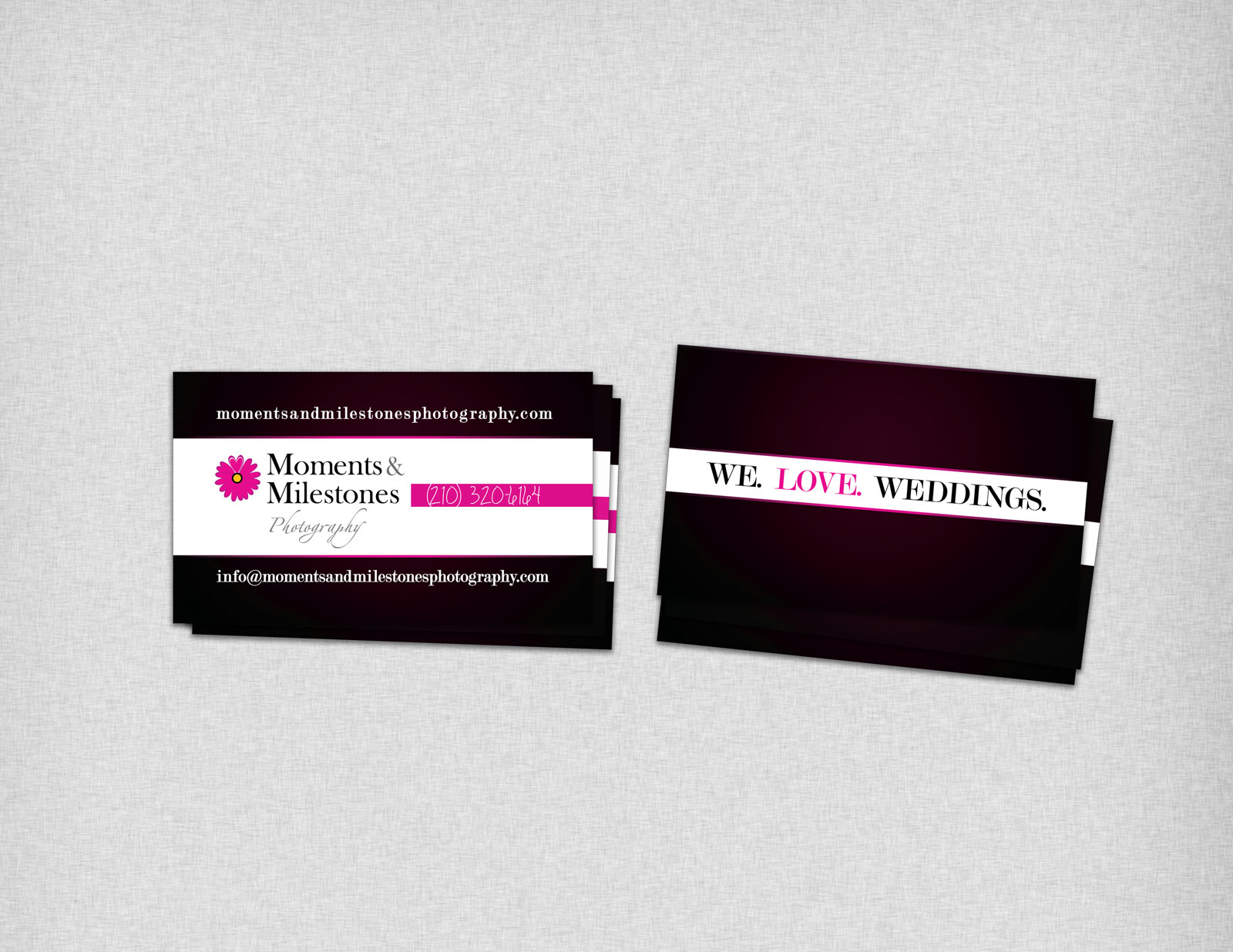
Sample of colours used for a high-end, bright, feminine look.
Colour In Regards to Printing
Depending on your printer or printing budget, you may be limited to CMYK (cyan, magenta, yellow and black), RGB (red, green and blue) or a pantone colour.
Pantone colours can be confusing to design newbies, so take a minute to remember when you had a crayon set as a child. If your parents did not have a ton of money, you may have at only 3 colours, red, yellow and blue; in order to get orange you had to mix yellow and red. Mixing colours to get another colour is like CMYK printing. Now let’s say you have 96 crayons; if you wanted to use tangerine orange, you just grabbed that colour from your box and every time you needed more tangerine orange, you grab the same crayon and got the exact same tint of tangerine orange. This is like pantone colours. Pantone colours are pre-mixed colours that guarantee consistent applications of the colour. Pantone colours also come in metallic inks, neon and pastels; you can get colours that may not even be achievable with CYMK or RGB printing.
Not all printers will give you ink choices; you may have to limit your selection to what they stock or find a printer that stocks your desired ink.
When selecting your colours, consider the emotions that colours evoke in context to the audience that you are in. You may have to look at a colour theory book or colour psychology book when selecting your colours.
Alignment
You don’t have to center all of your text on your card but you can if you are going for a balance look. Give right or left aligning text and graphics a chance but i don’t suggest using more than 2 alignments on one card, otherwise the design will get confusing and lose hierarchy.
Sample of different alignments in business card.
Finishes
There are a ton of specialty finishes that you can splurge on, so I suggest only using 1 or 2 at most; any more than this will make the design busy and will have less ROI. Here is a list of possible finishes that you might have one your business cards:
Rounded Corners
Some people like this since it prevents the corners from being nicked. You may also find it enhances a metaphor for your company or maybe corners seem to harsh for your image.
Emboss/ Deboss
Make sure your paper can support this. Some papers will have the emboss completely see through to the other side while other papers may be so thick and strong, an emboss may only be visible on the front of the card.
Silk Laminate
This will make your paper water and scratch resistant. You won’t be able to write on your cards either. This will give a synthetic or high end look to your cards.
Spot Gloss
Perhaps you want your card to be matte and to make your logo glossy? Perhaps you want to have a ghostly gloss of your logo or background image by only showing a gloss and not highlighting an inked part of your design?
Foil Stamp
This can be expense, so it may not be in the budget for a small business owner. You will get a metal foil stamped onto your card. A budget friendly alternative is to consider using a metallic ink.
Dye Cut
A hole or cut out shape in your card can help enhance a metaphor you may have with your business; make sure you have one before spending the money on this.
Custom Cut
Okay, so maybe a rectilinear card is not for you. Maybe you want a circle, oval, triangle or other shape. As long as you have a good reason for it, go ahead and try it… just be sure the shape is durable enough to be a card and can fit your content on it.
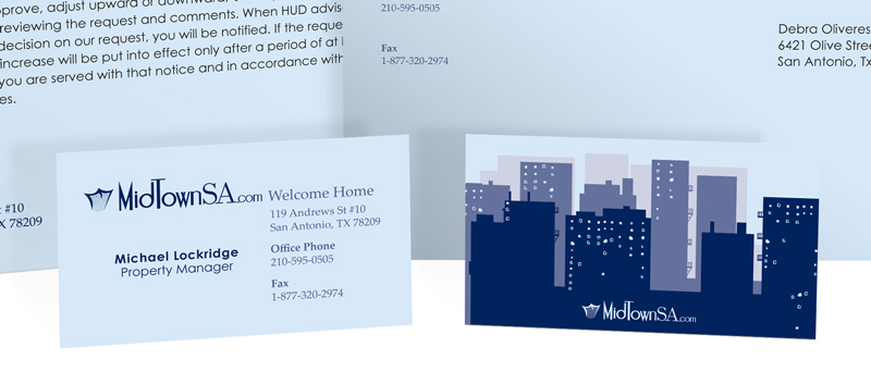
Folded Cards
Imagine a typical business card size that flips open and has more information inside. This is particularly handy for realtors as the tend to have a lot of stuff on their cards.
In Conclusion
Yup, designing a business card takes some serious thought and is a lot of work. With the right choices, you can have an awesome card and truly represents your brand.
As a small 2 cents… avoid using those DIY online printers. They sell by quantity (mass quantity), and won’t have the same appreciation for quality that your local printer may have.