As a small business owner, you probably don’t have a budget for a marketing director, so how are you supposed to make informed design decisions when it comes to making your company’s logo? You know how critical your logo is to your business; it needs to encapsulate your brand in a very simplified form, white working in very small or very large applications.
Here you will learn the different types of logos out there, what can lead to a succesful logo and a list of tips for people looking to design their own logo.,
The basic types of logos in a nutshell
Icon based
This is just a graphic icon without words.
![]()
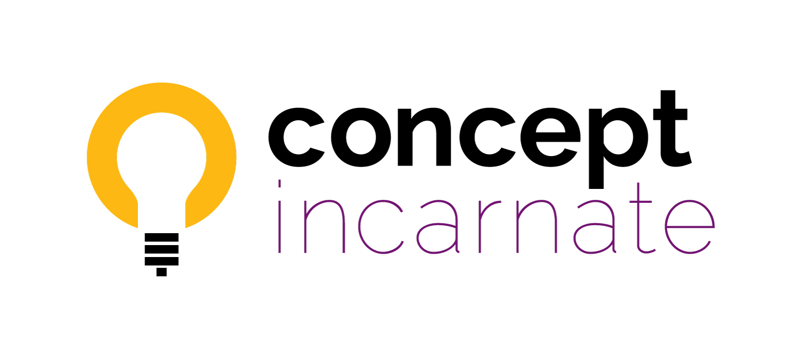
Icon Base with Wordmark
This is the basic icon, paired with lettering that sometime will have options for the lettering to move around the icon depending on the application of the logo.
Wordmark
This is more like when someone types out their name and does little customization to it or you read the letters first, then see a hidden icon or other Easter egg.
![]()
Monogram
This is something that focuses on the initials of your company’s name… maybe with a hidden object but it is not required.
![]()
Here are some techniques for making a good logo
Combination of Shapes
This is far more than just shoving two object together. This is a difficult to achieve synthesis of 2 distinct ideas or shapes or letters. You can’t separate one idea from another.
If you try to combine objects, try not to add more than 2 ideas/objects together; less it more. You can try to make a matrix of objects on your X axis and ideas/feeling on the Y access and try to combine every combination that is matched up on the matrix.
You can also to combine an object with another object OR a idea/feeling with another idea/feeling (which is harder).
![]()
Repetition
Repeating letters or shapes help to bring unity to a logo. Try drawing your icon, then repeating that same icon and rotating it 90 degrees. Try repeating the object overlapping the original instance of the object.
Variety
Too much of the same can get boring and predictable. If all of your lines are thin, try using a super thick line. Maybe turning a letter upside down in your name will call needed attention and achieve a goal you have in mind with your wording. Whatever you have been doing, try not doing it… at least for part of the logo. Notice that the Repetition technique comes into play here.
![]()
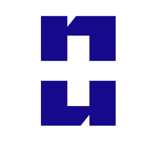
Positive and Negative Shape
Awareness of positive and negative space is important. You may be lucky enough to hide one shape within another; this can give your viewers a nice ‘ah-ha’ moment when they see this trick.
![]()
Combination of techniques
The best logos will use tricks from more than one of the above listed techniques.
![]()
Here are some quick tips for a good logo design.
- Make sure your imagery makes sense to your industry and audience. Don’t use shapes just because they look cool to you. Using shapes without purpose is a good indicator of an inexperienced designer.
- If you use the initials of your company in a logo, use only the first letter or initials of your company’s name. Don’t use letters in the middle of the name; It just doesn’t make sense and will confuse everybody.
- If you are making an icon + workmark logo, make sure to avoid putting the letter inside of the icon or in a small proportion to the logo. If you don’t head that advice, you will have to use your logo at honking big sizes to keep the wording readable OR put that icon at a decent size while making the lettering unreadable (so why have the lettering at all?)
- If your logo icon can’t shrink down to a half inch, then it probably is not simple enough.
- Really think about the shape of you logo before thinking about colour. Remember the combination, positive and negative awareness, and repetition techniques. Try designing your logo to work in black and white to keep your focused on the shape of your logo.
- When you pick your colours, really think about them intensely. Colour psychology can vary by market area. For instance, the colour red makes you hungry in America or can be seen as an angry colour, while in China is a sign of happiness. White is a colour of freshness and pureness in the United States, but in China it is a colour you wear to funeral. Locally in San Antonio, rainbow colours are associated with Fiesta, but nationally they are associated with Gay Pride. Really know your audience and your desired perception when picking your colours.
- When trying to design your logo, try looking at objects from new perspectives and scales. Zoom in your focus really closely, then look at your object from really far away and then everywhere in between. Try drawing your object from the top, bottom ad sides.
- Always start your logo concepting with a piece of paper and a pen. If you go to a computer too fast, you will lose creativity and may feel scared about your lack of what can easily be rendered on your computer. Keep your ideas and hands free-flowing by generating ideas by hand, then taking your favourites to the computer. People also seize up on the computer or delete ideas they think are bad; that is a bad move. You need to keep the bad ideas too.
- When sketching, your first ideas are typically your worst. Draw a lot, then draw some more. Keep trying until you accidentally draw a few good logo concepts. Take breaks, even a few day long breaks and come back to the logo. Review your previously sketched ideas and see if they can be improved or inspire a different idea. Draw everything you see in your head, even if you think it will be silly.
- Most importantly, make sure your logo appeals to your target audience and not you. While we are on the subject, make sure your target audience is tightly defined by income, age, interests and region.
- Any rule can be broken when making a great logo, but make sure you are an authorized logo designer before breaking rules. 🙂
Further Notes
Logos are copyrighted by the artist that designs them. You can’t find a logo you like online and slap your name on it without infringing on the artist’s copyright. If you commission someone to design a logo, unless it is specified, the copyright remains with the artist. Copyright ownership begins as soon as artwork is created; the creation does not have to be registered with the copyright office to hold a legit copyright. If you want to hold better ownership of a logo (and you should since these things are expense), you can put a TM (™) on the logo somewhere; you can only use the R (®), when the trademark is registered with the government.
Whatever you do, don’t buy a cheapo $5 logo online. It is most likely a bad logo AND/OR infringing on someone’s copyrights.
In conclusion
Yup, making a good logo is hard. My advice is to leave it to a professional as they will be expertised in making great logos; you are probably expertised in what your business makes or sells. Now, you are probably thinking, “But hiring a designer to make a logo will be expensive and I can save money by doing it myself.” Making a logo yourself can be costly in the long run. When you remake your logo, you will have to re-print your business cards, banners, coffee mugs, etc., and keep your current audience in the loop about the change (possible with a costly marketing campaign). A bad logo sets your business up for a bad impression and you will have to fight an uphill battle trying to win the sale of your potential customer. Save money and outsource your logo design to a graphic designer.